




.svg)




Big Fish
Entrepreneur Jacob Najjar approached us to launch his caviar business with a splash.
Sourced from the mighty beluga sturgeon all the way in the Caspian Sea, his caviar is the finest money can buy, delivering a smooth, buttery flavour that breaks gently on the palette and leaves an exquisite aftertaste.
But in a market that’s teeming with players of a similar size, we needed to find a fresh way to attract the attention (and appetites) of new customers.
Caviar branding can be a little conservative. The category is dominated by prim and proper businesses, where ornate tins, sedate colours and restrained messaging are all too common. When you’re selling sophisticated dishes for sophisticated palettes, this approach makes a lot of sense.
But when everyone takes an identical approach, it’s hard to stand out and gain traction. Our identity had to draw on luxury codes and compete with the most refined competitors out there, without getting caught in the same traps and tropes that everyone else had.
To serve up some personality in a buttoned-up category, we created Big Fish. The identity focuses on the sheer scale of the animal that the caviar comes from, the beluga sturgeon, which can grow to seven metres long, weighs over a ton and swam with the dinosaurs all the way back in the Jurassic Period.
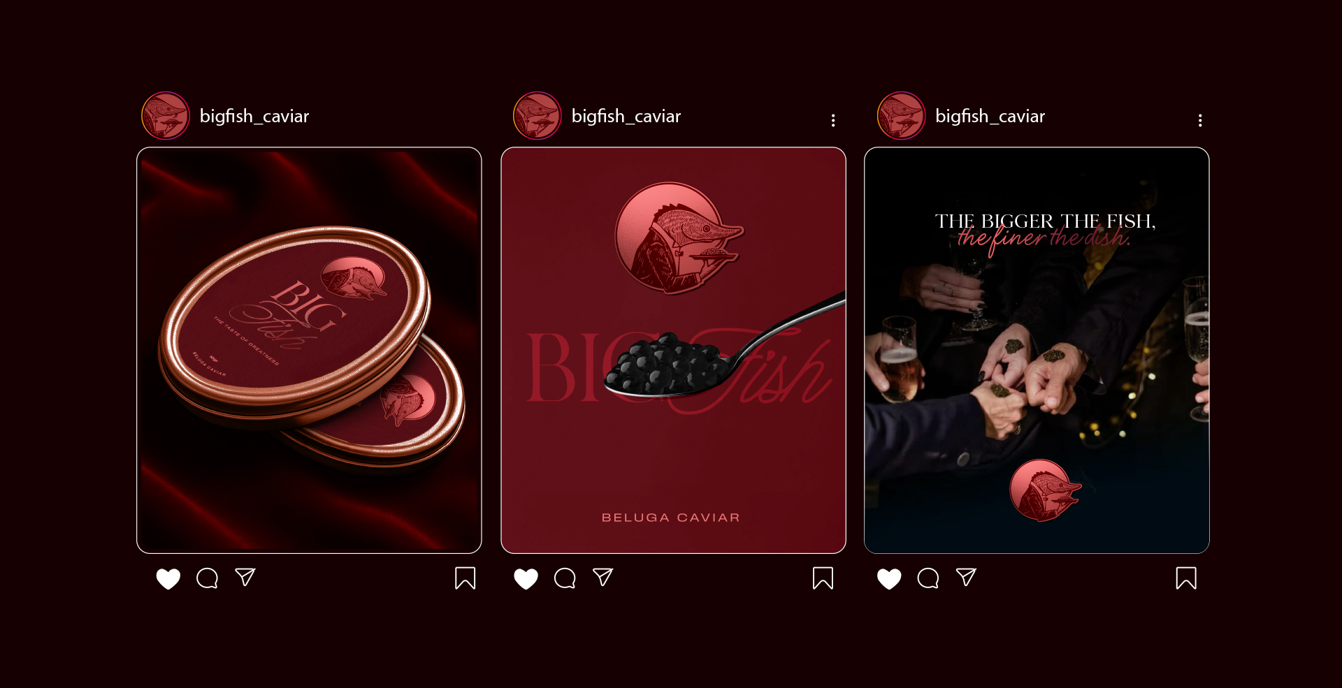
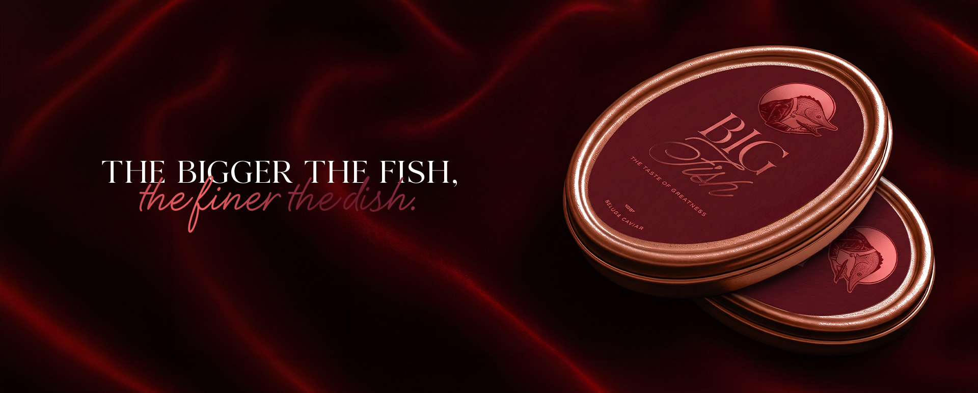
Going big wasn’t just a way to stand out: it made the caviar look more valuable. Because the fish is so large, it takes more effort to catch it and farm it, signalling to the reader that the food was a real labour of love.The greater the fish, the finer the dish.
A Mighty Mascot
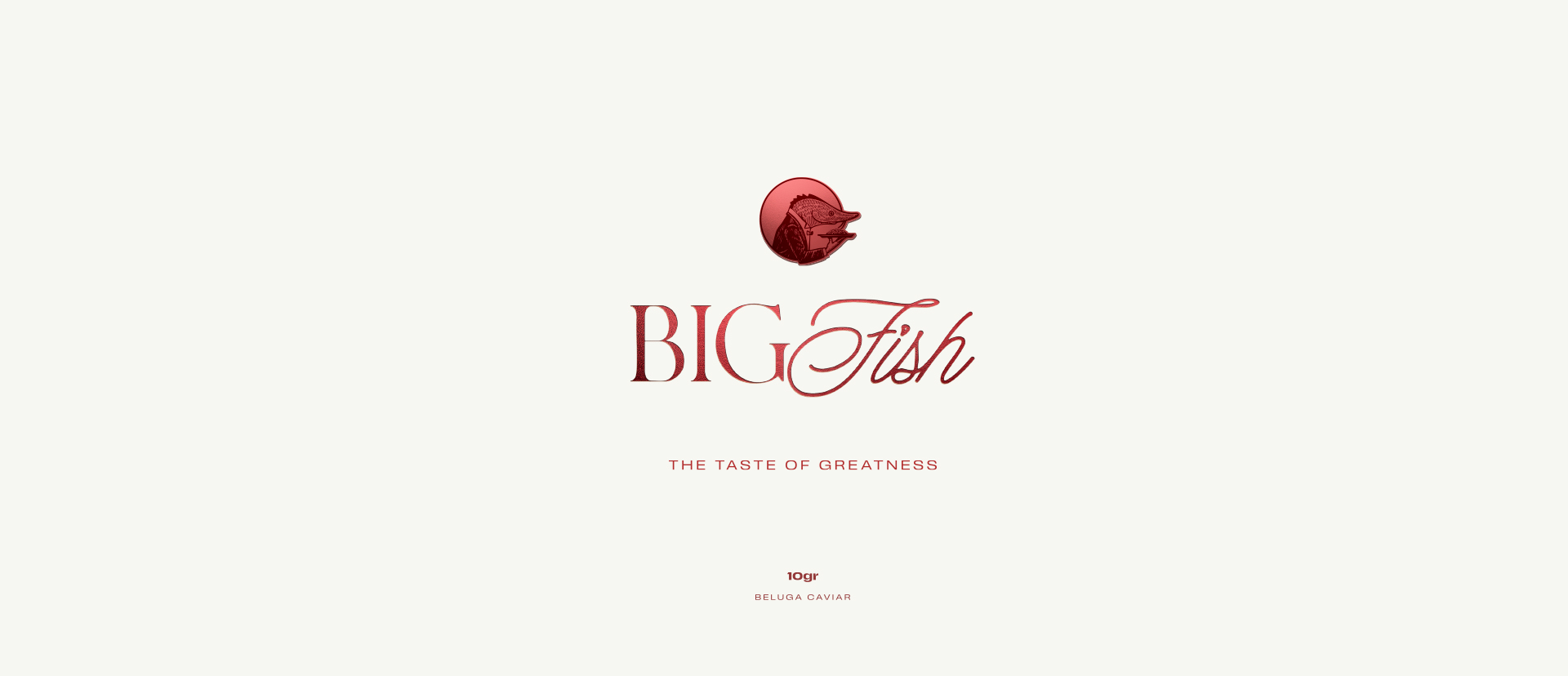
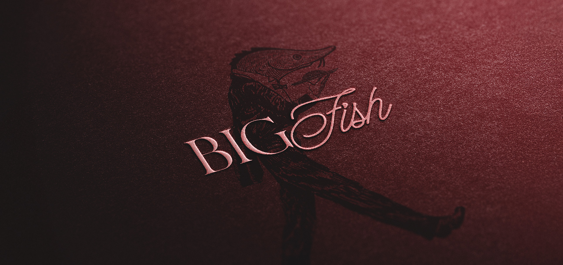
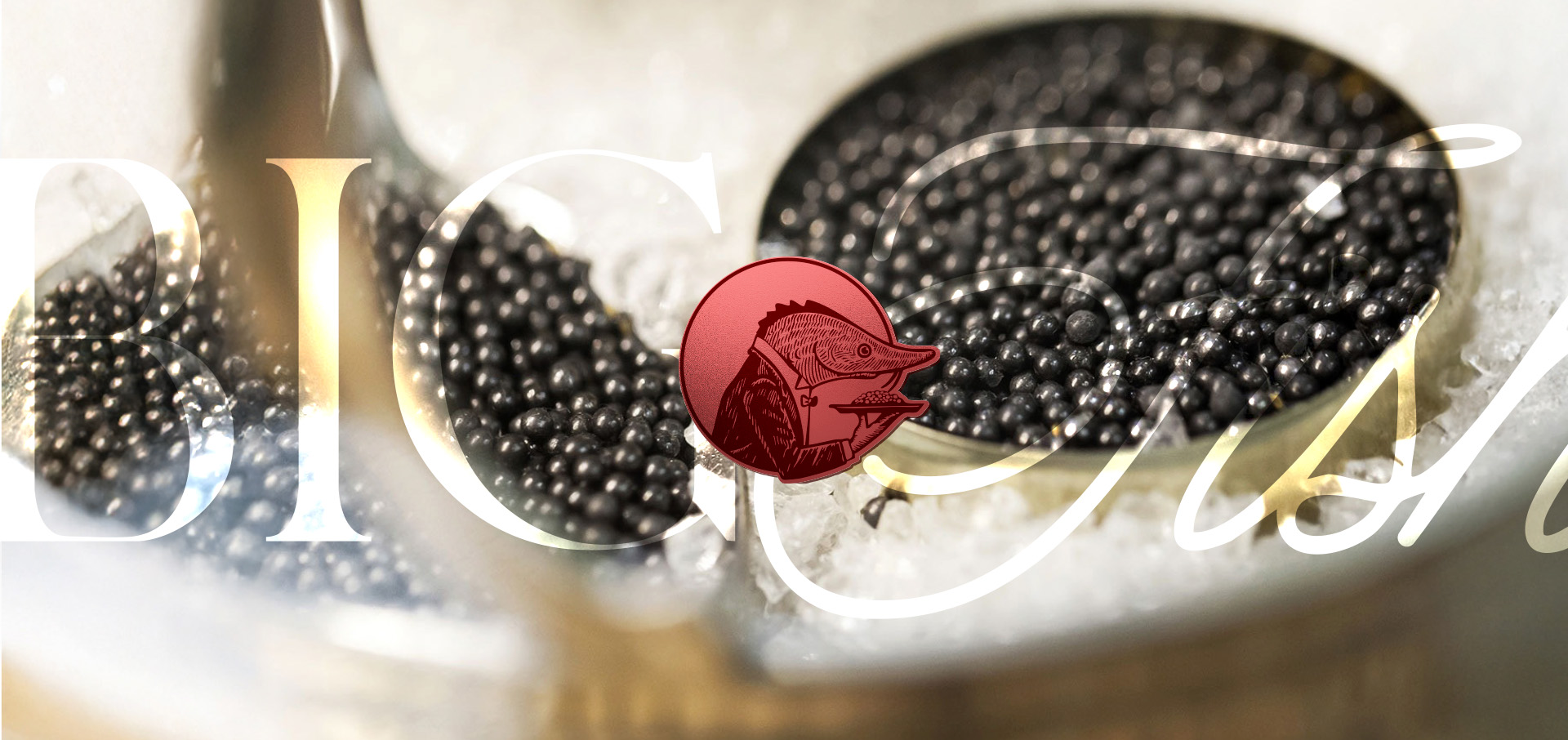
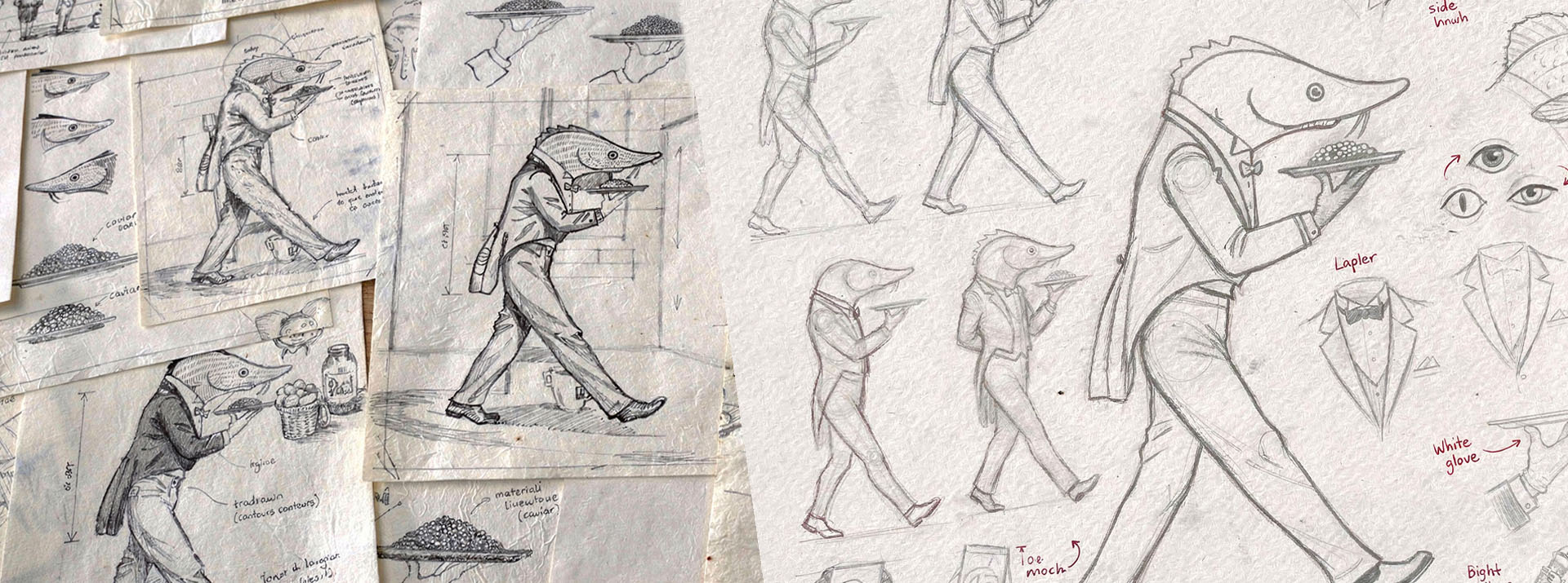
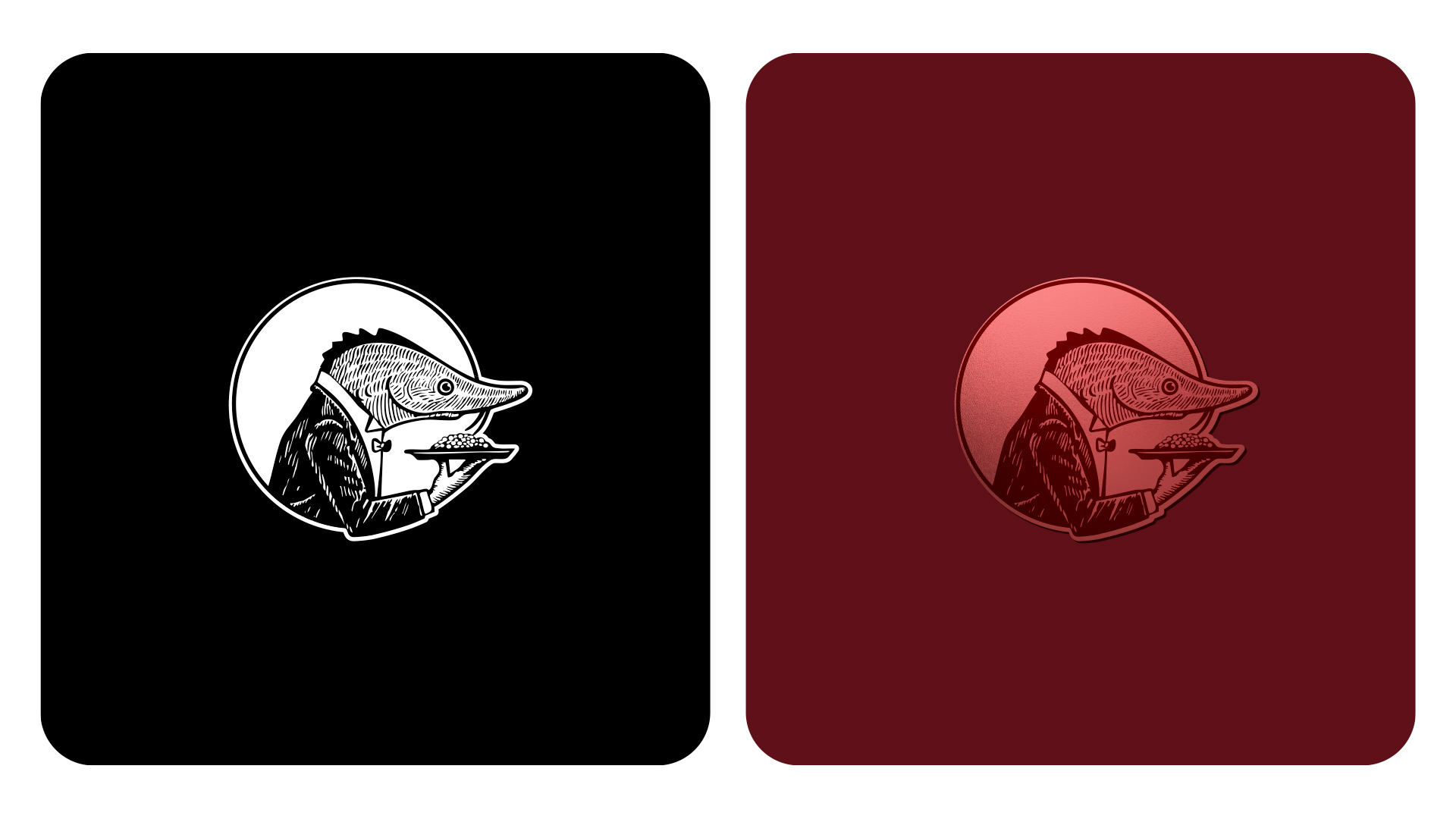
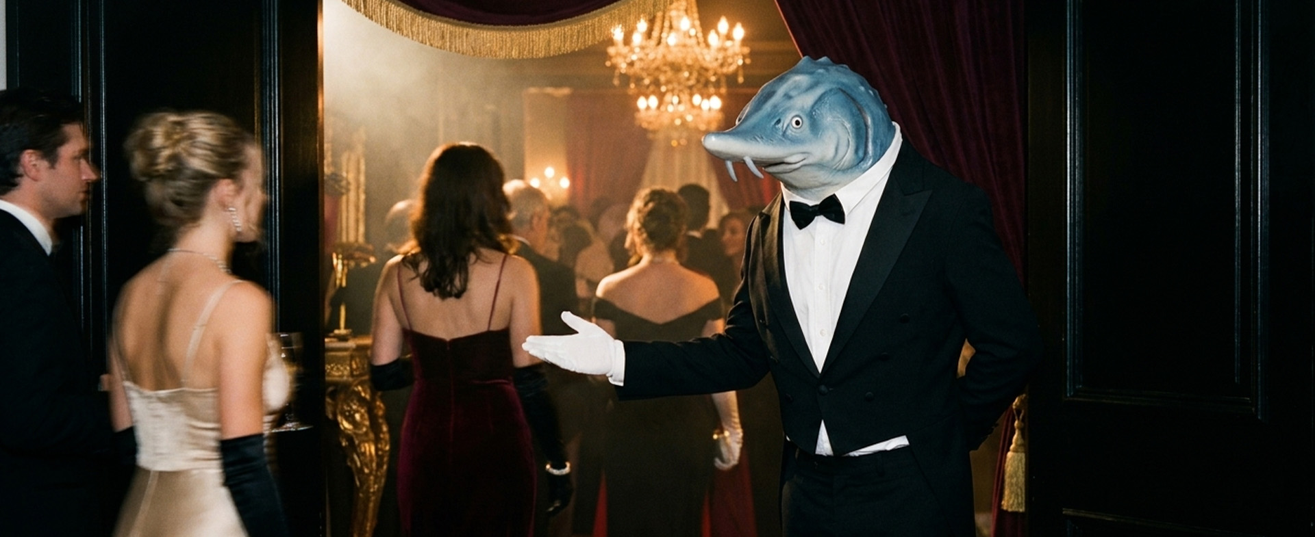
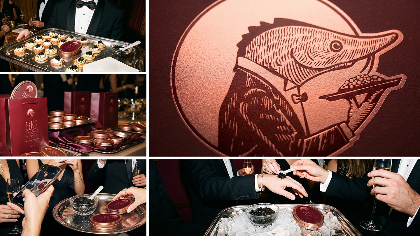
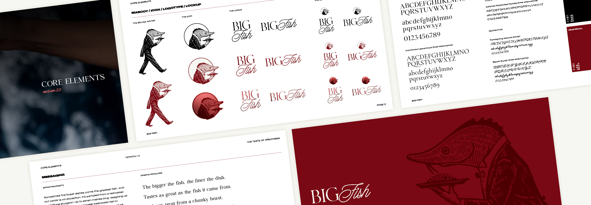
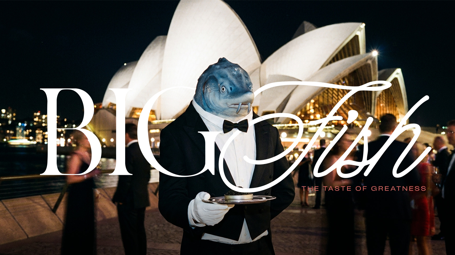
The brand was fronted by Magnus, a beluga sturgeon suited and boosted in a tuxedo and proffering a gleaming platter of caviar. Half sophisticated, half absurd, he was the perfect personality for a brand that blends luxury with memorability.
The Finest Fonts
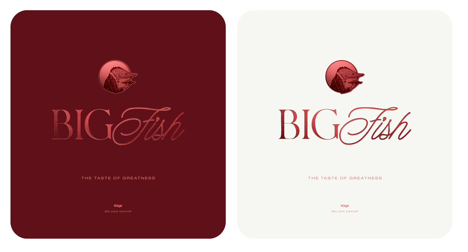
The font kept this balancing act going. The core font, Agatho Light, gave the brand grandeur through traditional serif outlines, while Fontspring Natural Script brought the flair, with cursive shapes that reflected the whimsical whiskers of the sturgeon itself.
Appetising Packaging
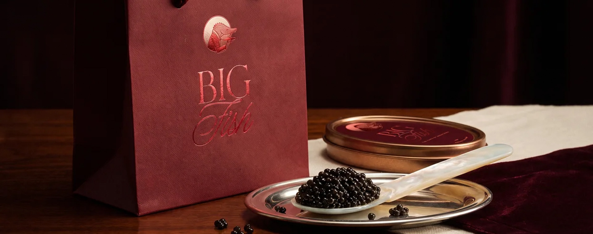
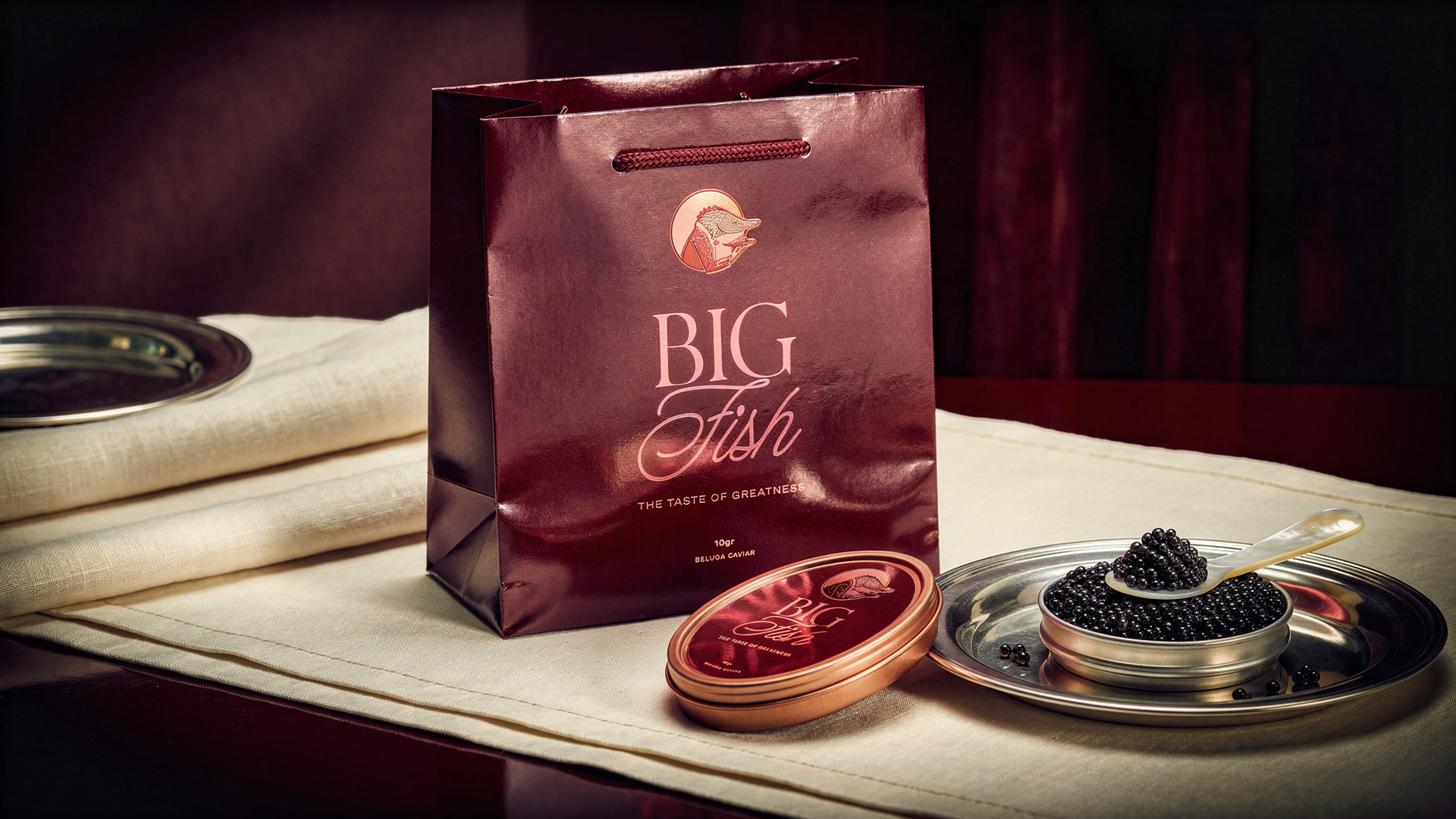
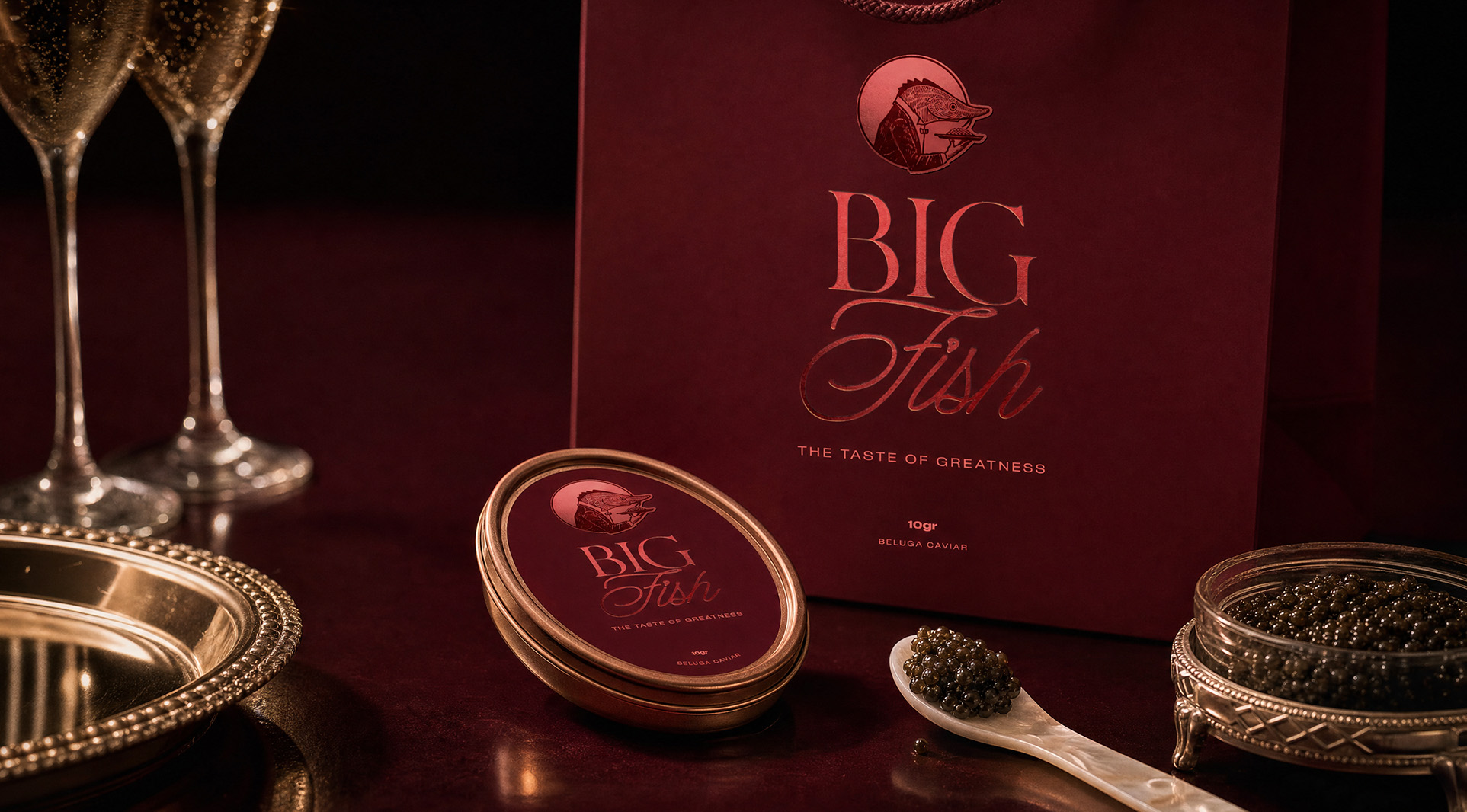
We crafted a classy sleeve-and-tray box, with a slow reveal pullout to create intrigue and suspense around the product. And of course, we wrapped a larger-than-life logo around the entire box, alluding to the magnitude (and magnificence) of the creature that created it.
More Projects
More Projects

.svg)