


.svg)
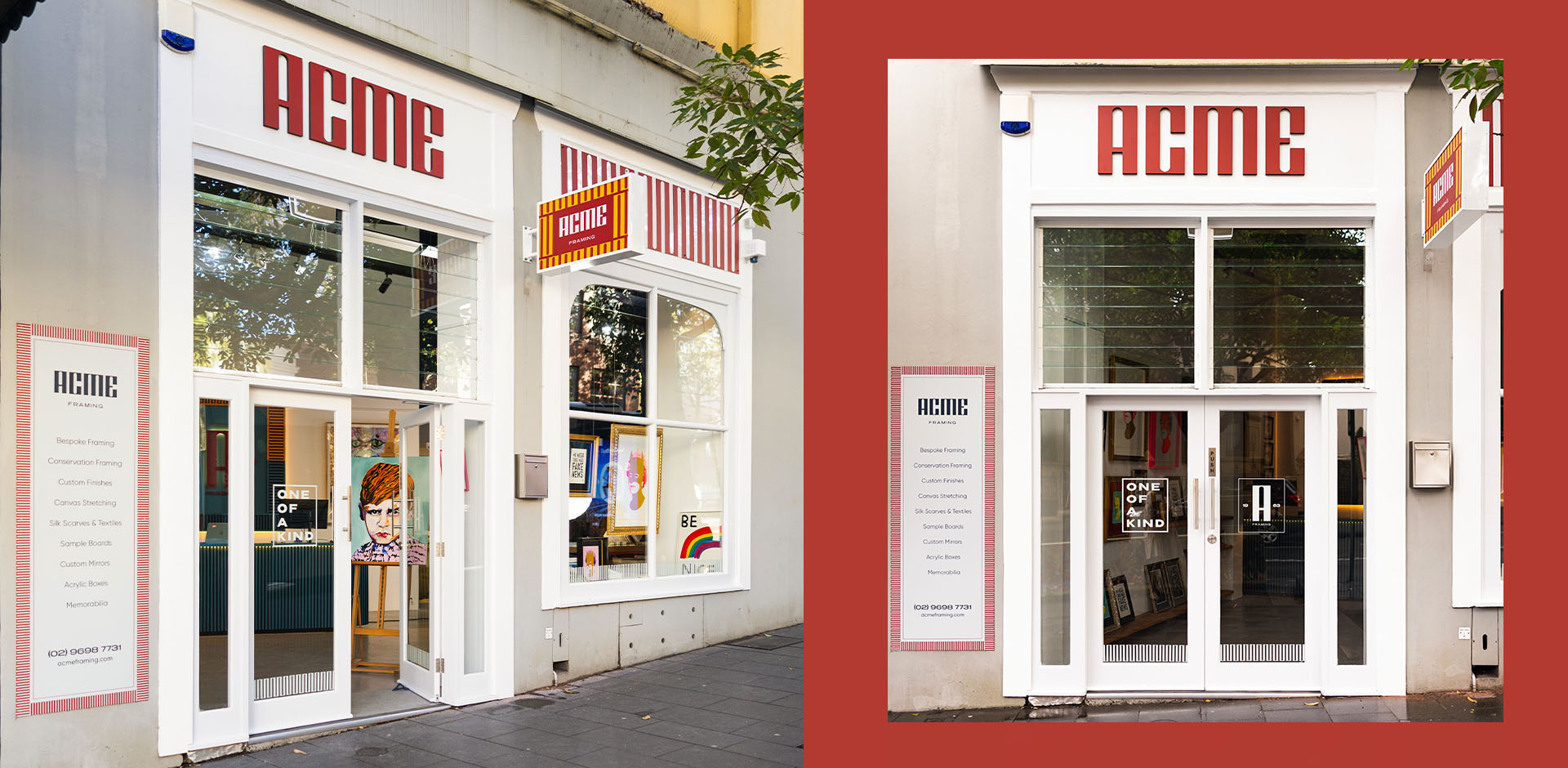
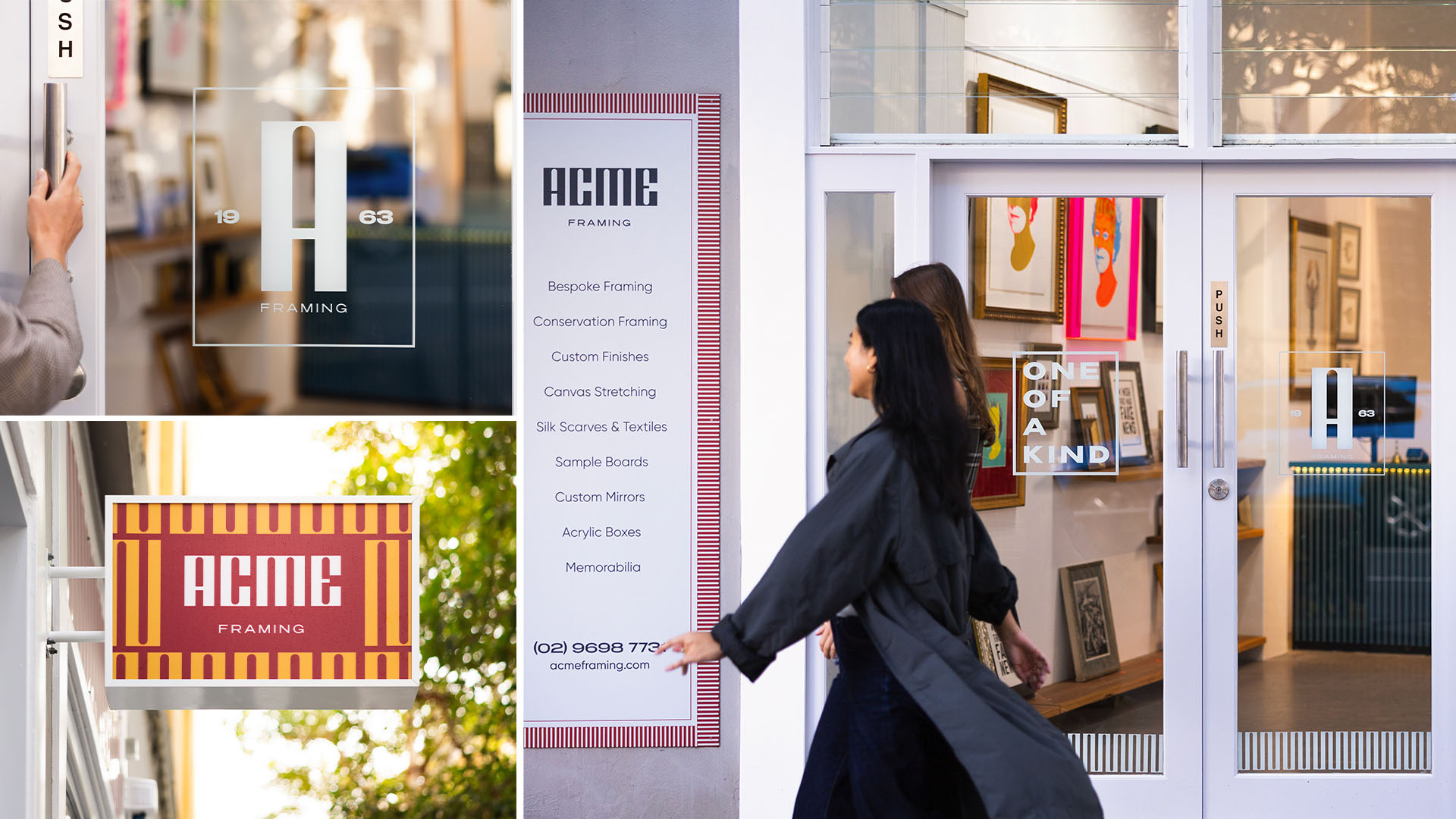
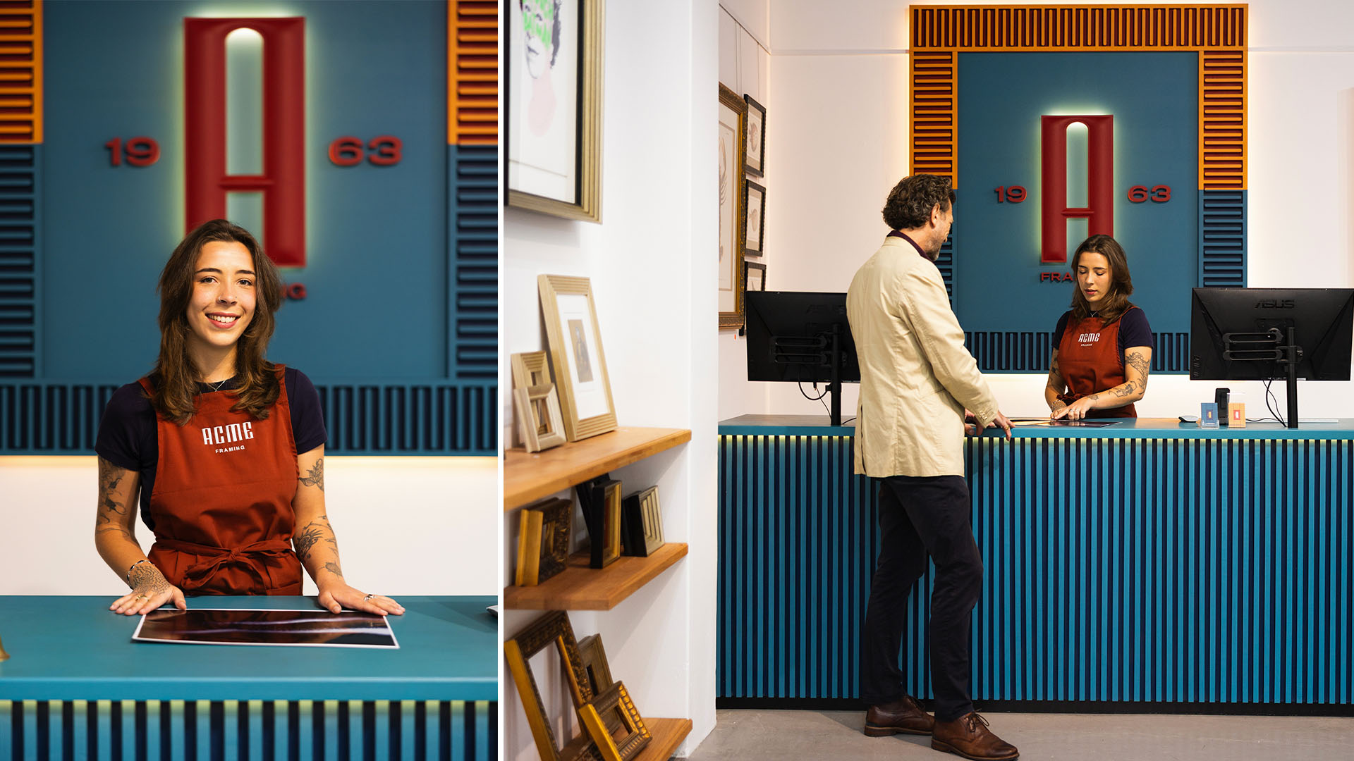
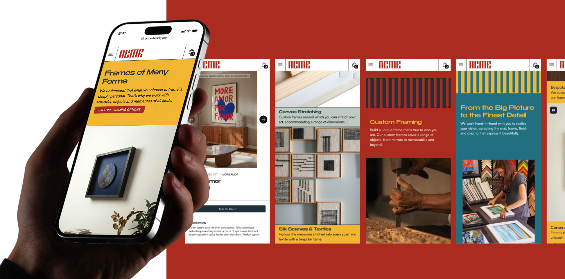
Acme Framing
Miramar came to us not as one business, but as seven. It was a range of underwriting agencies owned by Steadfast Group, each specialising in a very different category of insurance.
From insurance solutions for property and casualty risks, professional and management liability cover, to solutions for niche and under-served industries, these agencies offered coverage for a broad range of risks across many industries.
Visit Miramar Group Website
They wanted to consolidate their seven agencies under one of their most powerful and longstanding brands, Miramar. This would give them more credibility under the banner of one of their most well-established and well-resourced brands, while showing brokers the full range of what they could cover, creating more cross-selling opportunities, and an enhanced customer experience.
But they had to do so in a way that didn’t detract from the longstanding brand equity of each individual agency. In an industry where niche expertise is essential, the master brand still had to retain the specialist knowledge these agencies were known for: otherwise, the identity would lose the reputations established by the legacy brands, risking relationships and leads.
This was a textbook case of constructing the right brand architecture, one that combined authority and consistency with flexibility across every touchpoint.
We started by building a master brand that channelled the collective value of the seven agencies. After speaking to various business leads, auditing the competitive landscape and investigating each business line, a common UVP emerged: through a mix of seamless digital platforms, responsive support, specialist appetites and a wealth of coverages, the group gives brokers everything they need to succeed. This identity came to life with the tagline “Make Waves”, capturing how they’re disrupting the industry to power brokers’ growth, and an elegant wave-like “M”, demonstrating momentum while reflecting their new name: Miramar Group.
We then absorbed the seven business lines into three new divisions under a Branded House model: Commercial, Financial Lines and Specialty. This linked all their offerings within a coherent group identity, while preserving their specialist offerings for all to see, with the most niche product lines including Sports, Interruption and Engineering, retained under the Specialty business division.
This blend of scale and specialist knowledge informed everything we built for the brand:
Considered Colours
Deep Blue and Light Blue formed the primary colours for the master brand, while secondary colours like Emerald, Green and Orange differentiated each business division with a pop of colour.
A Versatile Voice
We channelled the voice of a seasoned entrepreneur, which blended qualities of both authority and agility. But we built in flex: certain qualities, like simplicity, expertise and energy, could be dialled up or down depending on which business division was talking.
Universal Values
We gave the group four values that captured the style, spirit and substance of every agency and addressed brokers’ universal pain points across all business units: Real Backing, Simplicity Wins, Made to Move and Scale for Growth.
The result: one group, three divisions and endless growth opportunities.
More Projects
More Projects


.svg)