


.svg)


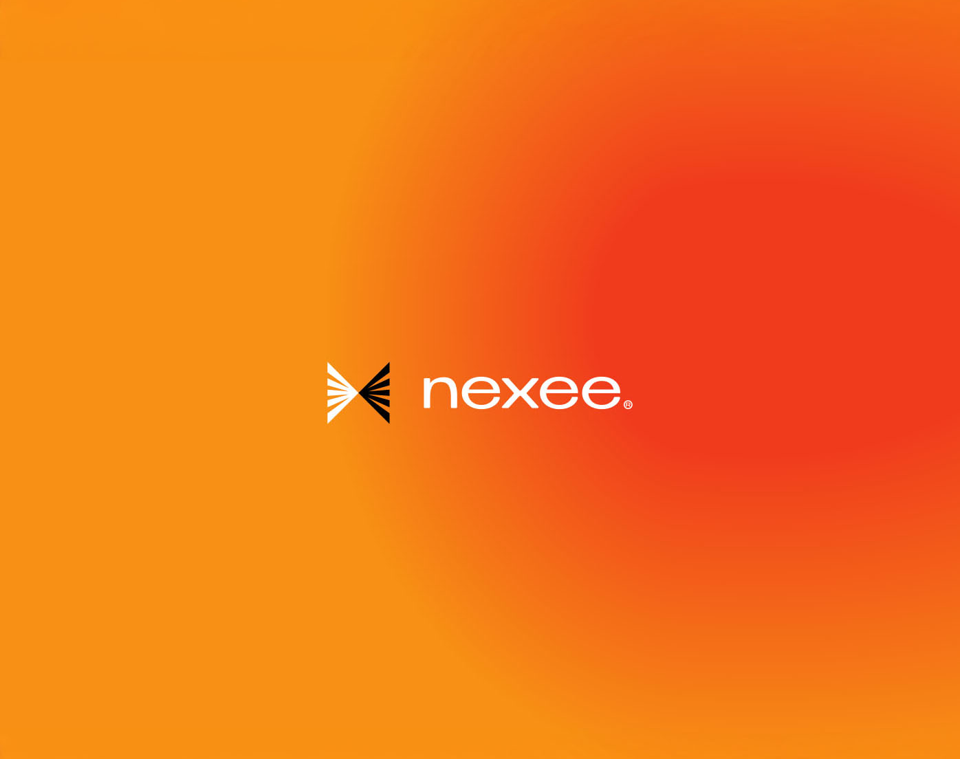


Nexee
Harbour ISP Becoming Nexee
Harbour ISP wanted to take their business to the next level. As an ultrafibre broadband company, they were looking to grow their market share by becoming the go-to provider for customers and property developers.
To build trust and win confidence, they needed to create a brand that was laser-focused on customers’ needs, tempting them to make the switch with a smart, targeted and compelling brand proposition.
Our audit of the category uncovered a market that was plagued with frustration. The culprit? Slow, unreliable internet.
We’ve all been there: clicking and tapping and huffing and puffing away at our computers, frustrated at a connection that won’t fix itself no matter what you do (or how much you turn it off and on again). And it’s not just a problem limited to customers: developers can struggle with the installation speeds many broadband providers offer for their properties, which has a real impact on their tight timelines.
Harbour ISP are here to fix this. Their ultrafibre service not only offers zero interruptions for everyday users, their fibre is integrated into every building and unit, offering a turnkey solution that developers can use straightaway.
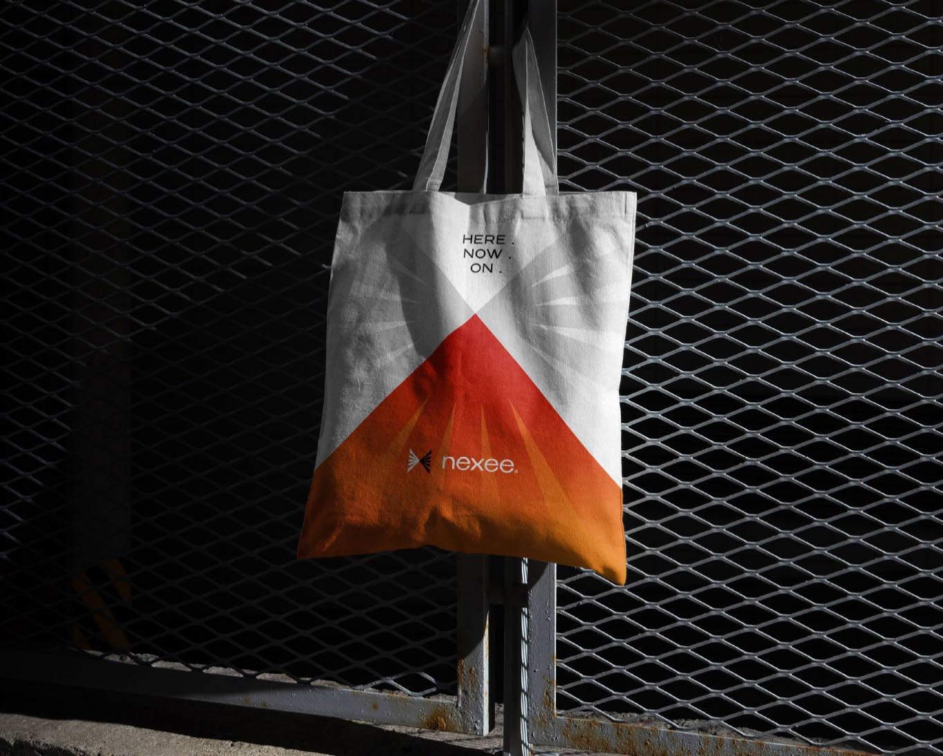
The key insight in all this? Everything is instant. The installation. The connection. And everything in-between. This led to our core proposition for the brand, “Here. Now. On”, showing how they make lives easier through high-speed, reliable broadband. It also inspired a fresh new name for the business: Nexee. A verbal fusion of “Next” and “Connectivity”, it’s a word that suggests innovation, modernity and the integration of technology into everyday life.
Gaming, streaming, browsing, sharing, liking, discovering, striving – all of it is yours to enjoy immediately when you’re connected to Nexee.
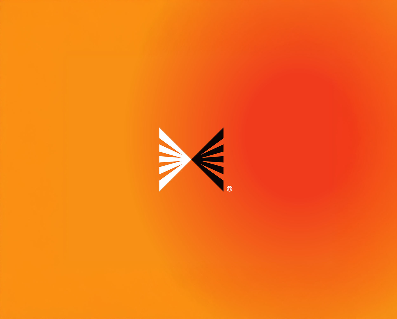
Logo
Inspired by a fibre optic cable that runs from A to B, it symbolises the very technology that makes Nexee’s connection possible.
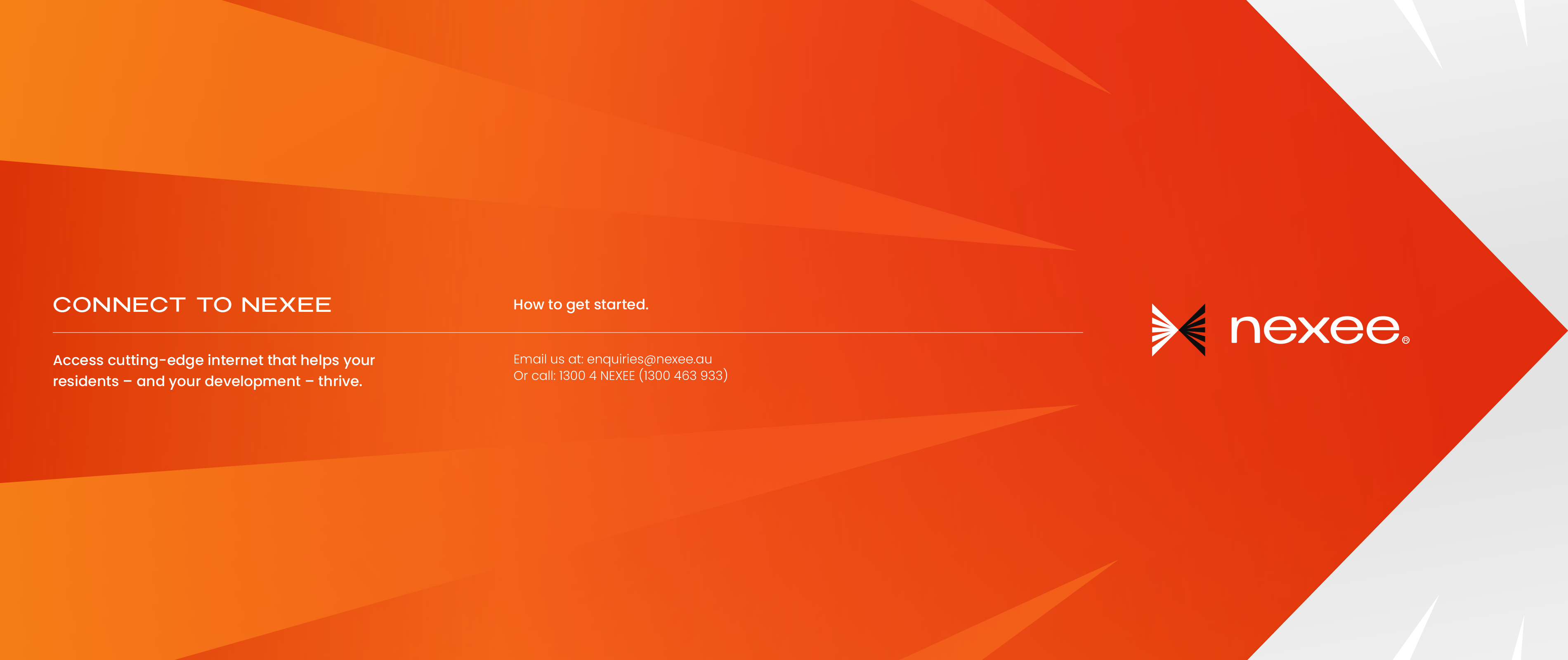
Visual Identity
The fibre optic cable from the logo is then applied as a visual device, showing how Nexee facilitates smarter, easier lives.
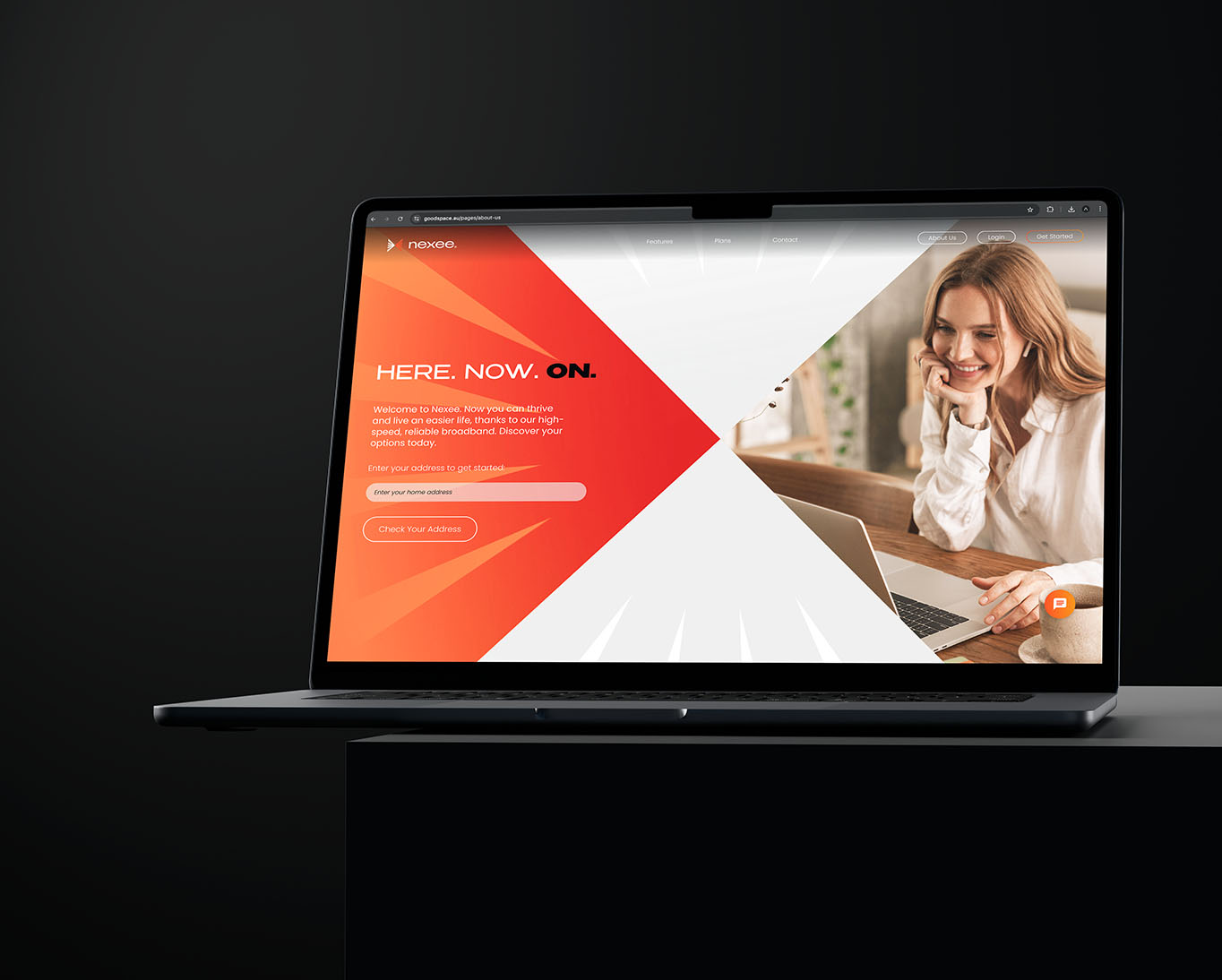
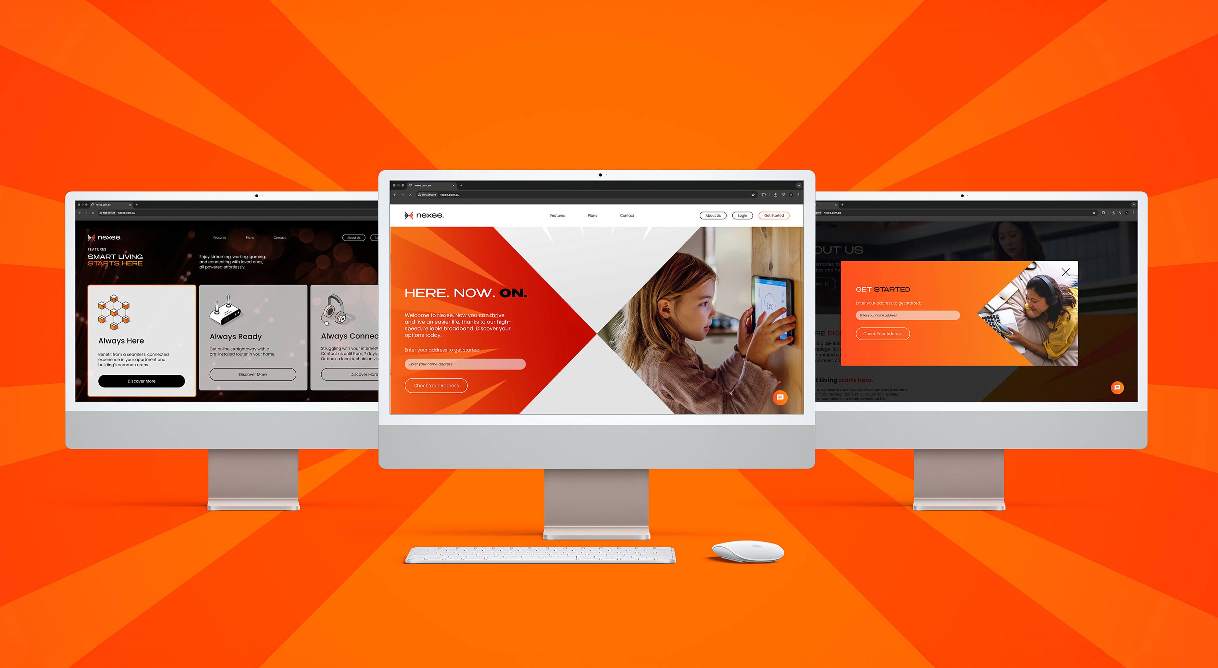
Website
Complete with bold visuals, sharp copy and clear icons, we crafted a web experience that was as simple and streamlined as the broadband itself.
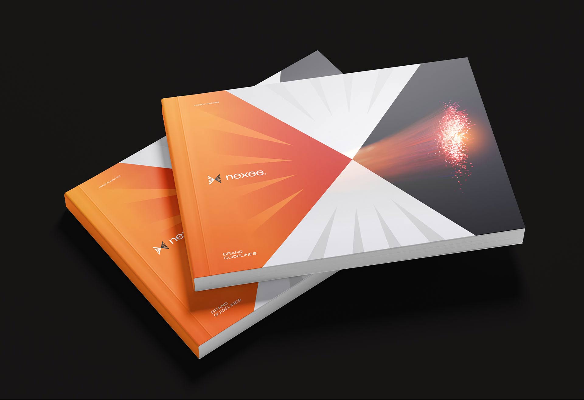
The Results
With a brand that appeals to their audiences’ need for speed, Nexee are well-positioned to grow for years to come. Their bold new platform shows customers they get them, understand what bad internet feels like, and – ultimately – hate waiting as much as they do.
More Projects
More Projects
.webp)

.svg)