


.svg)


Space Logic
Space Logic is a family business that specialises in space and logistical storage management. The company has been successfully operating for more than 30 years and have been visible in 3 different categories for space and storage solutions: commercial, industrial and medical. They have an enviable reputation for providing end-to-end services to their clients, supplying project design, planning and installation services across their own innovative and customisable range of products.
Their strength as a company has increasingly been evidenced through their work in the medical field. Thus through reflecting on their successes, it was decided to reposition their focus for their primary offering to be creating storage solutions for the healthcare and medical industry.
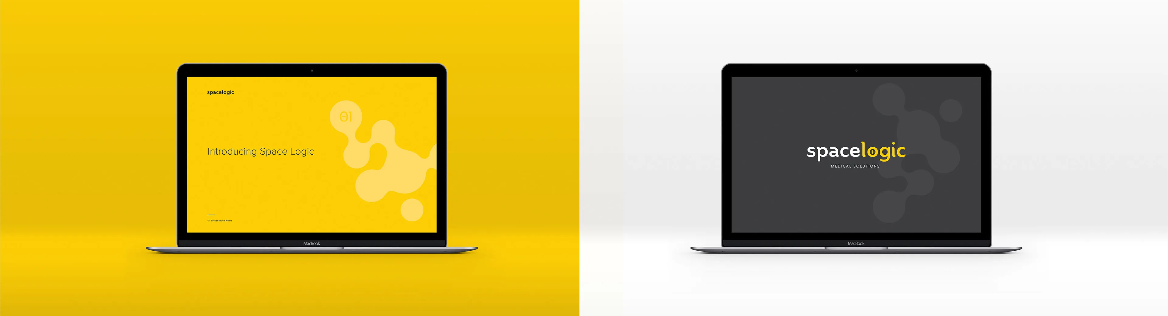
TOAST’s challenge was to rebrand the company with its new industry focus, re-creating a refreshed identity for Space Logic that communicates the company’s expertise in space management in the medical category.
Accompanying this brand redirection, the business sought to develop a monthly subscription package to maintain an informed relationship with their clients. Within this, Space Logic will be activating their resources on the ground, becoming more visible and recognisable for their swift follow-up actions and response manner akin to that of NRMA. Further, they also expressed their desire to expand and deliver their business services beyond Australia, creating further impetus to appropriately redesign their brand footprint.
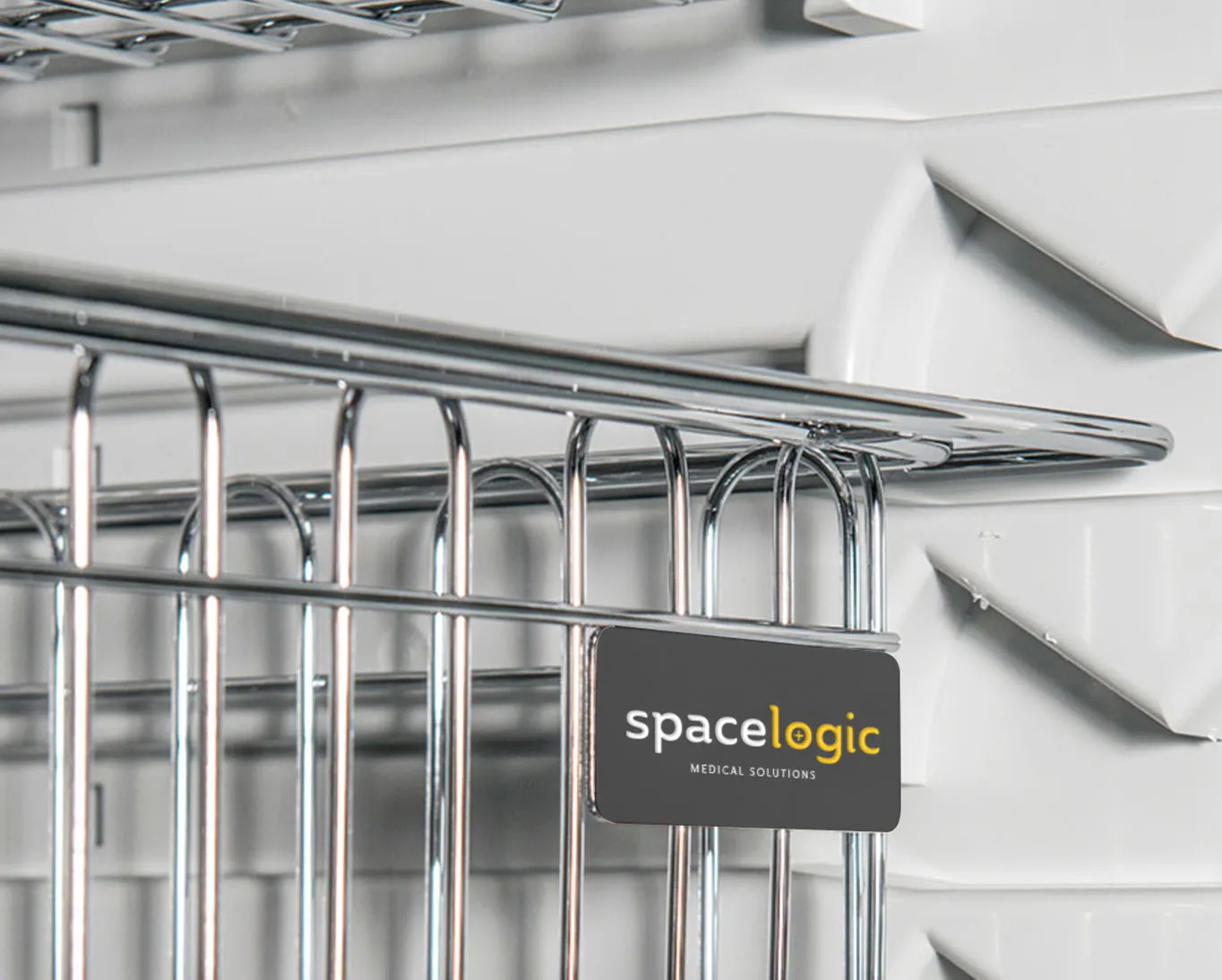
In reaching their business solution, TOAST first needed to understand their key target audiences across the medical sphere, and what their needs and challenges are at present. A safe and secure storage environment was primarily identified as a need across CSS Departments (Central Sterile Services), Pharmacies and Operation Theatres.
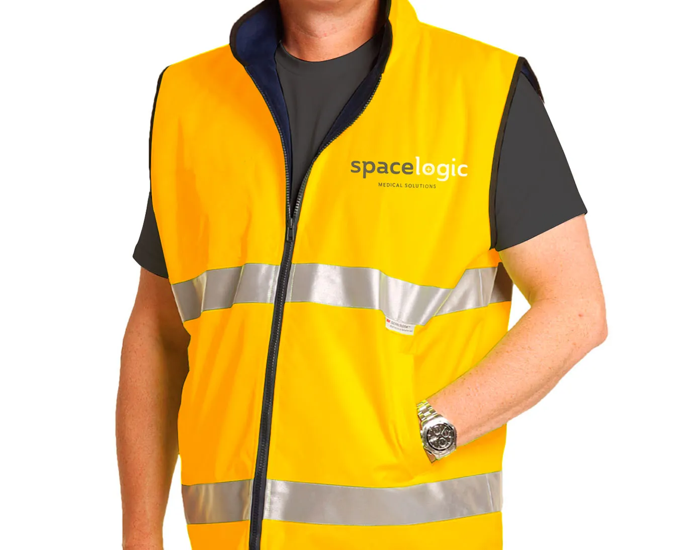
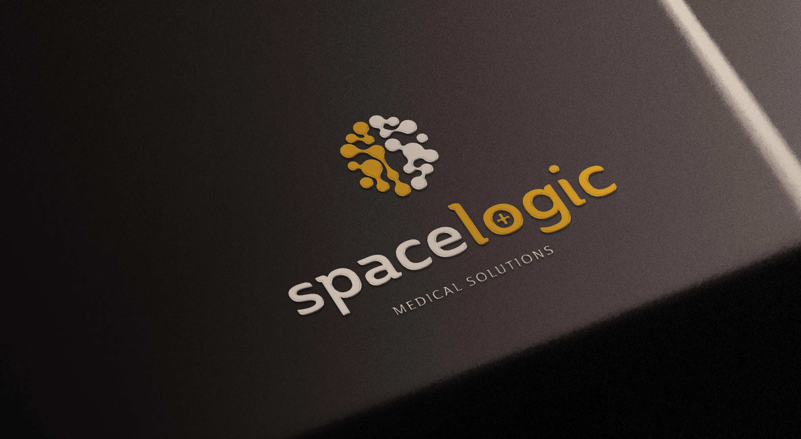
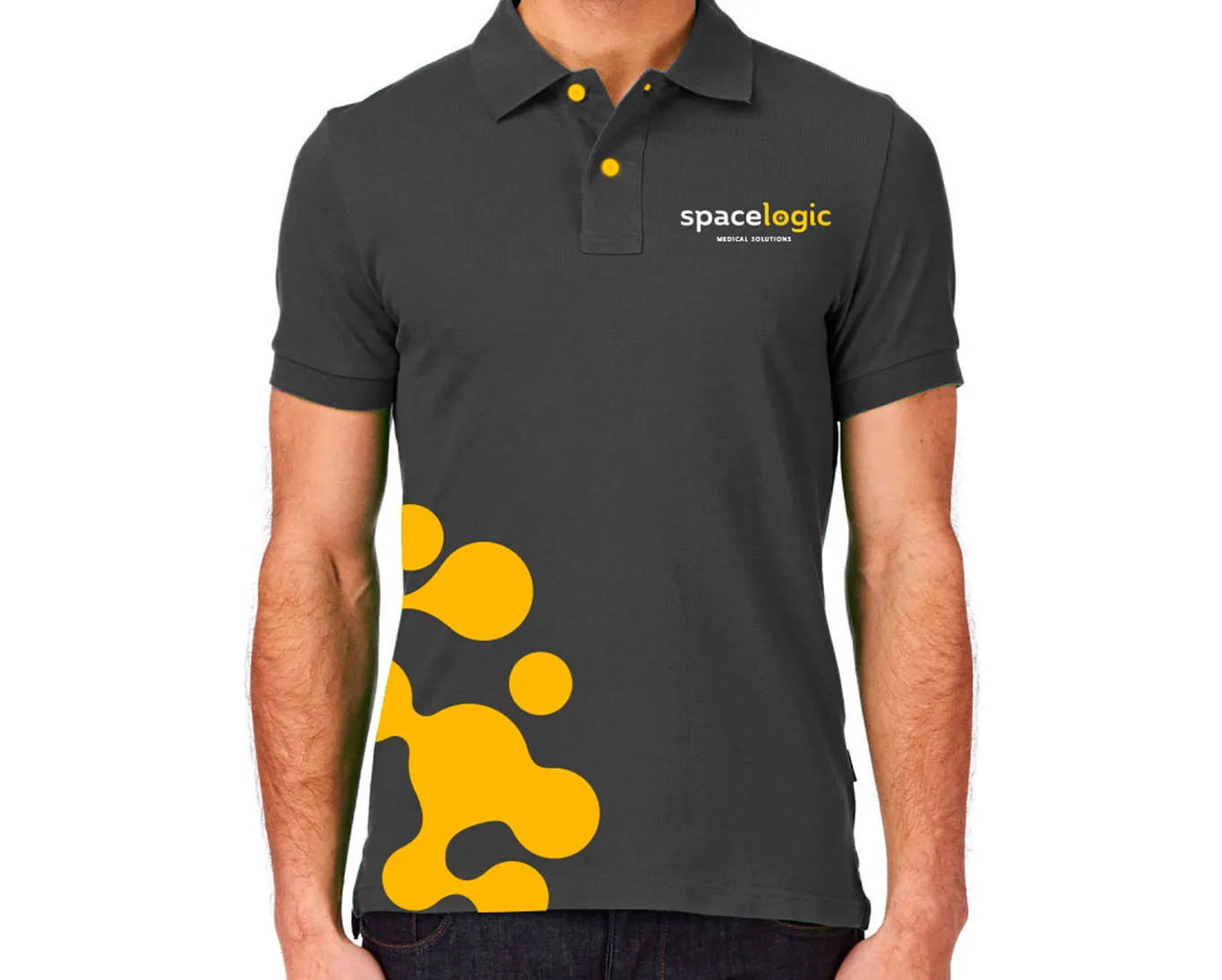
To separate Space Logic from its competitors in the market, TOAST positioned their business as one that “enhances the healthcare experience with advanced medical storage solutions”.
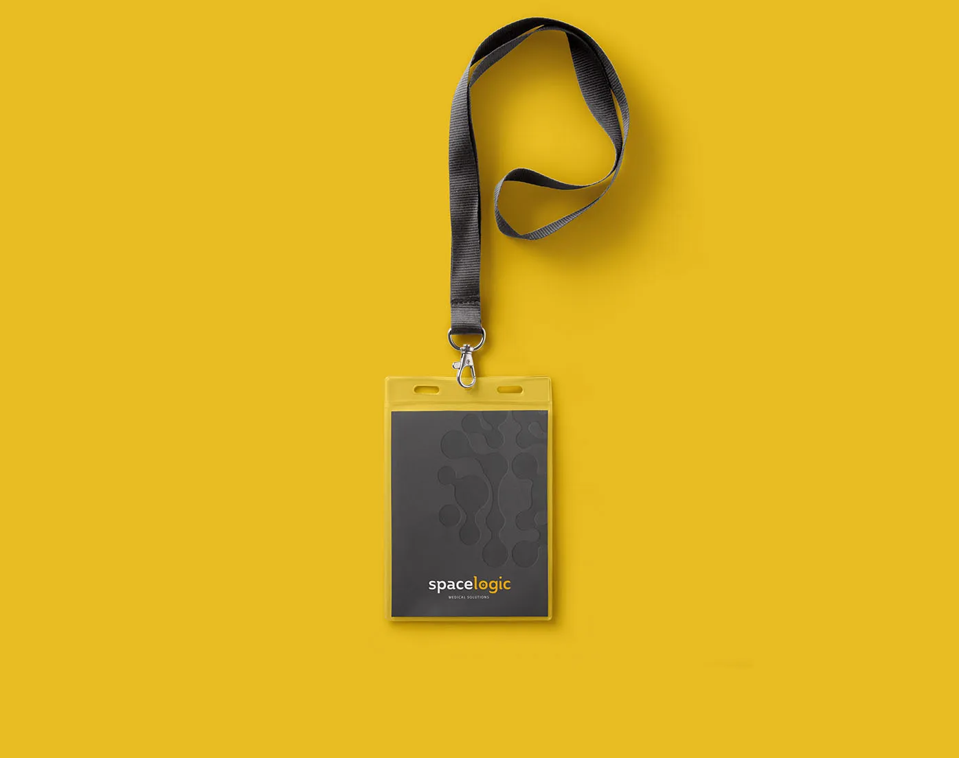
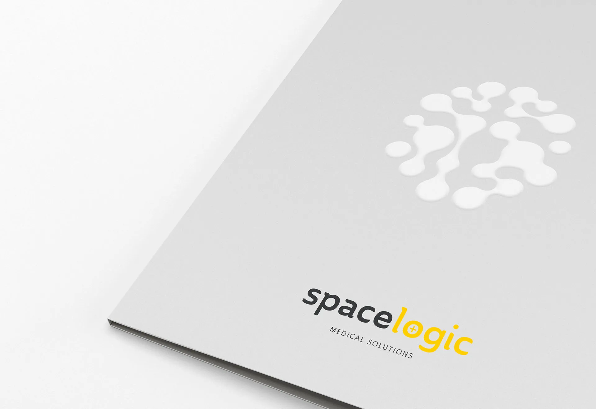
The contemporary shape of their final logotype is symbolic of the bespoke manufacturing solutions offered by Space Logic, separating them from market competitors. Further, the brain iconography of their logotype accompanies this message, demonstrating their company mission of providing a clever and optimised use of space. The curved, organic shapes present an approachable and human-focused company, positively setting them apart in their global expansion ambitions.
More Projects
More Projects
.webp)


.svg)