


.svg)
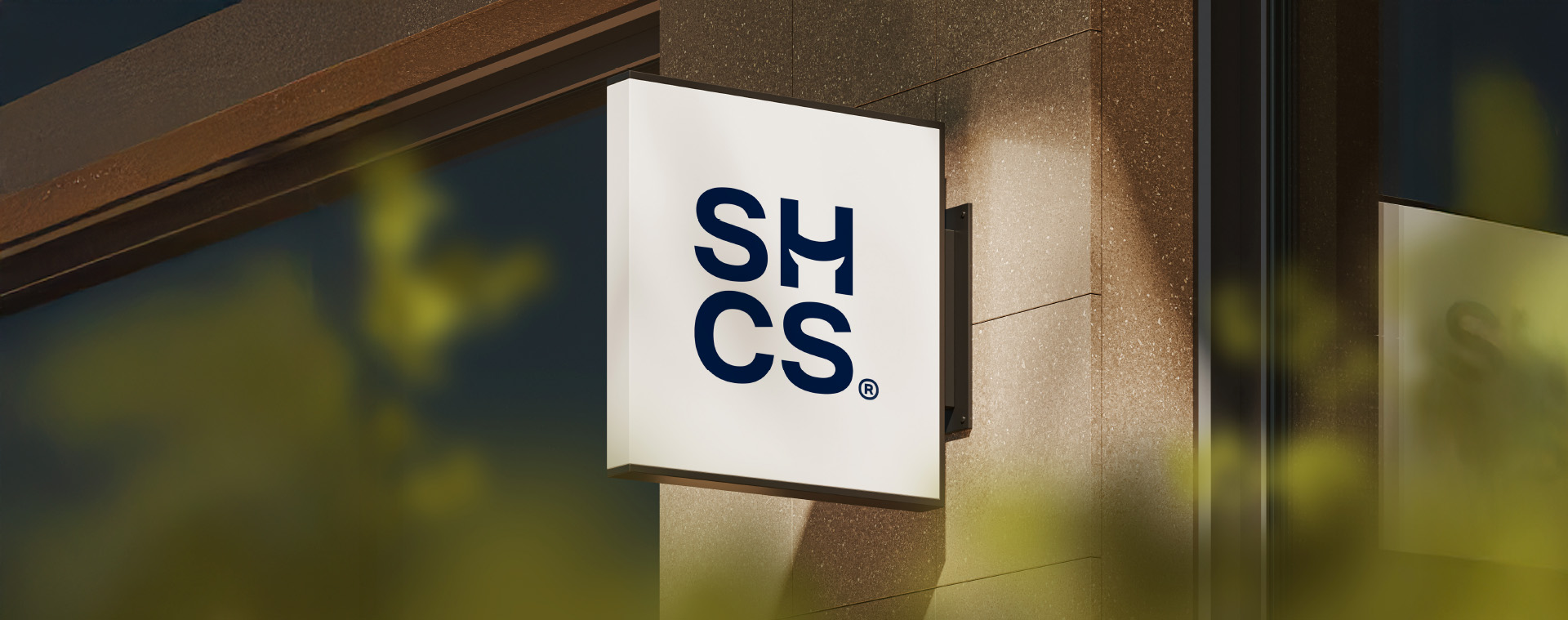

SHCS
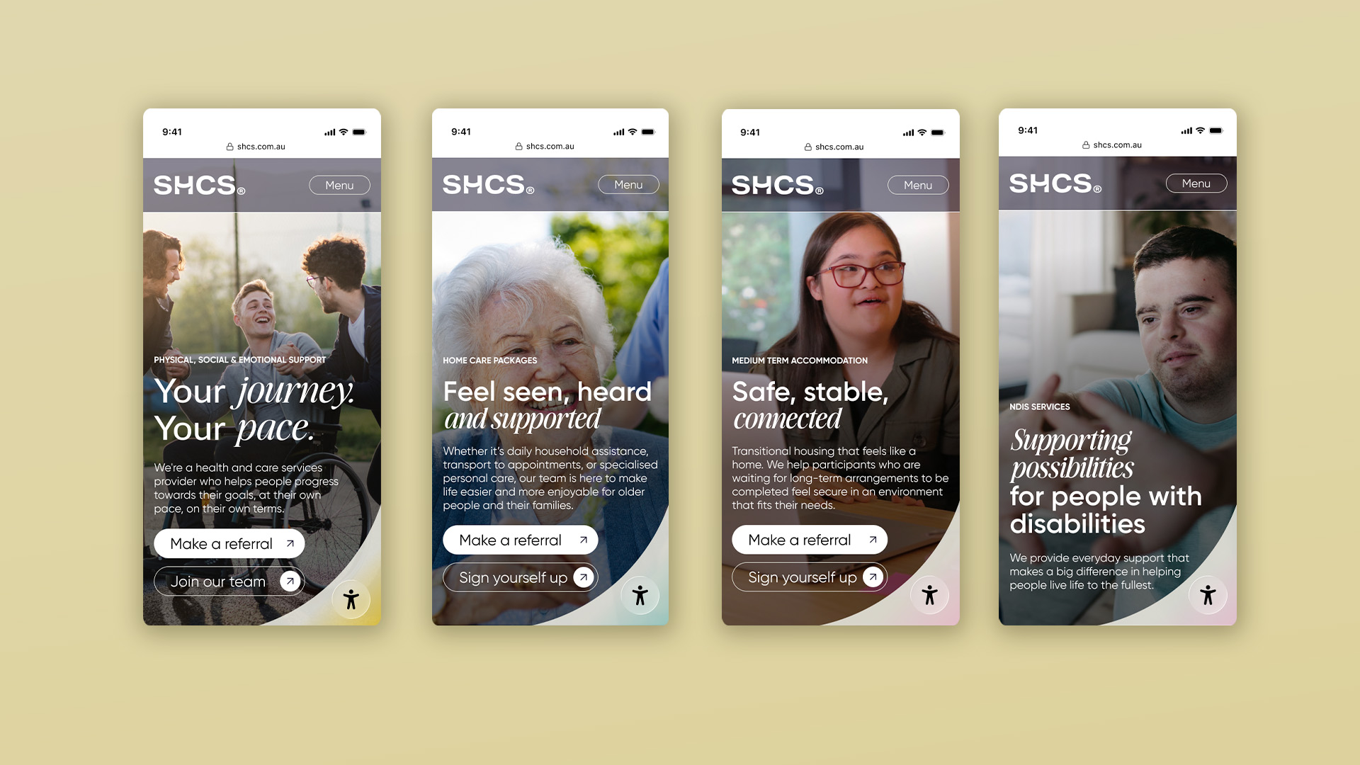
SHCS is a care provider that offers way more than just care. They help people facing physical, social or emotional challenges reach their personal goals by making them feel safe – and confident – enough to try things out. It could be making a meal, taking a walk or getting out of bed for the first time in years. Whatever the goal, SHCS is here to help you get there.
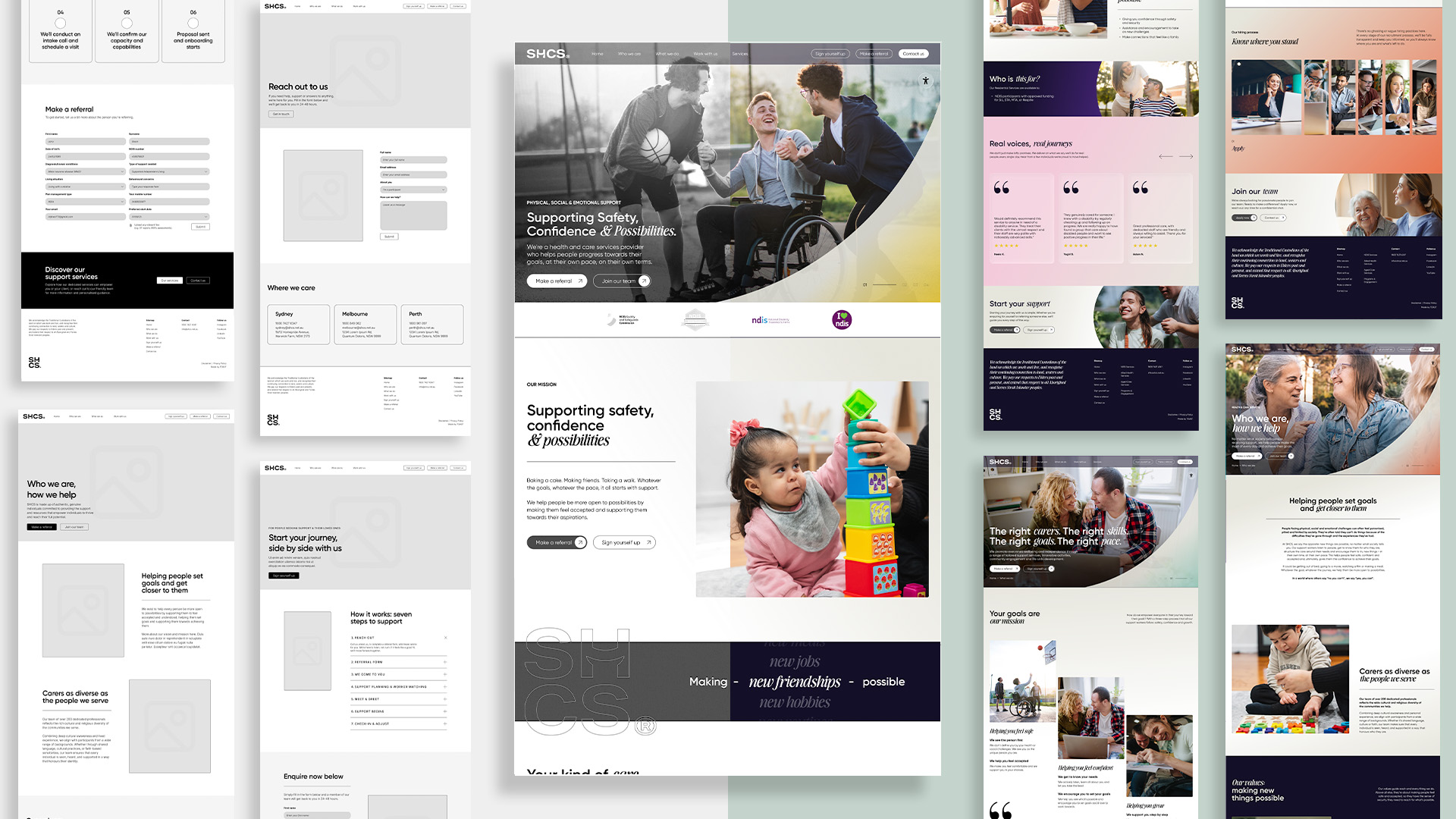
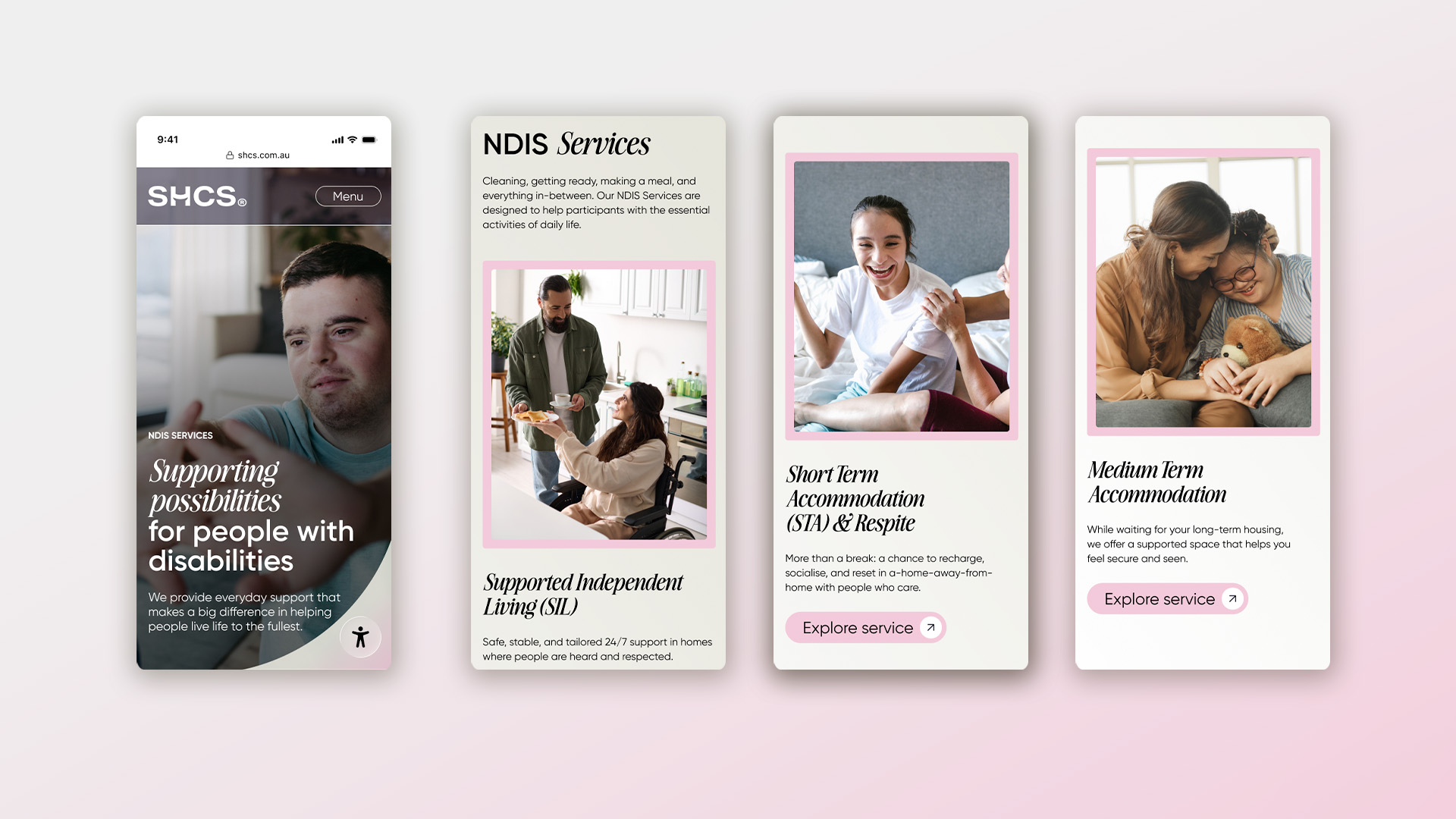
To bring this life-changing service to more people across Australia, they needed a brand that would help them expand. One that captured the essence of their care, while building exposure in a crowded sector. They also needed a system that would reflect the kaleidoscopic breadth of what they do, from NDIS and Allied Health to Programs & Engagement, in a neat and digestible way.
Here’s how we helped their brand flex, grow and show the world what makes them different.
Visit Website
The problem we needed to solve for our audience became very clear, very quickly.
People facing physical or emotional challenges can often very patronised, pitied and limited by society. They’re often told they can’t do things because of the difficulties they’ve gone through and the experiences they’ve had, so much so that they feel judged by the people around them and end up avoiding new activities.
This stereotype can be reinforced by the certain brands within the care category, where participants are presented as objects of pity rather than active agents of change in their own lives. If SHCS were to succeed, they couldn’t fall into the same trap.
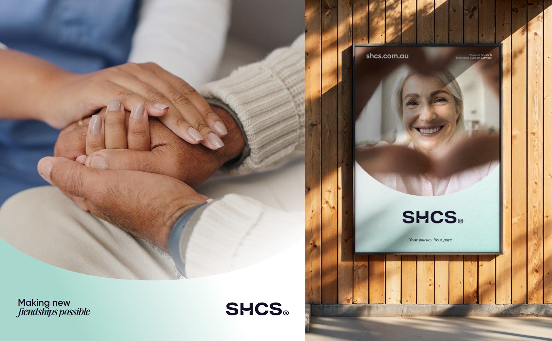
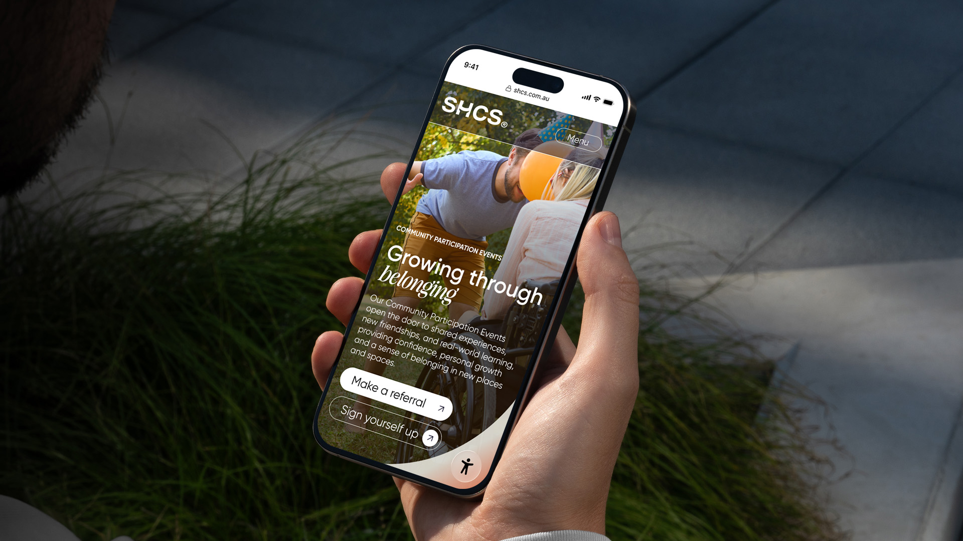
Enter some much-needed optimism. We wanted SHCS to stand for something more upbeat and positive in the sector, positioning them as the care provider who makes new things possible for people, no matter what society has to say about it.
To back up this concept, we shone a light on SHCS’ process: their support workers really get to know people, structure the care around their needs and encourage them to try new things. This helps people feel safe, accepted and, ultimately, gives them the confidence to go for their goals.
Here’s how we embedded this can-do philosophy throughout the brand:
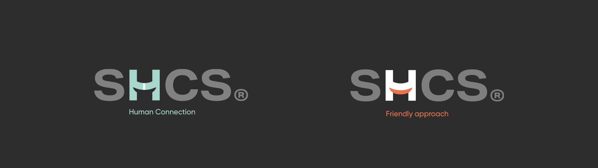
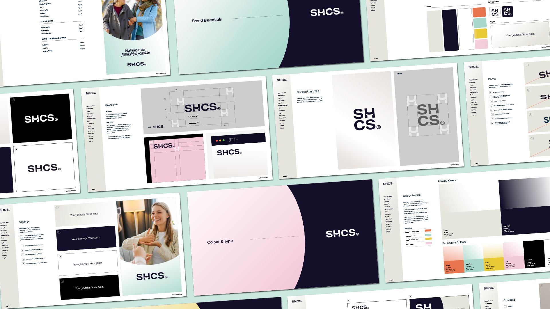
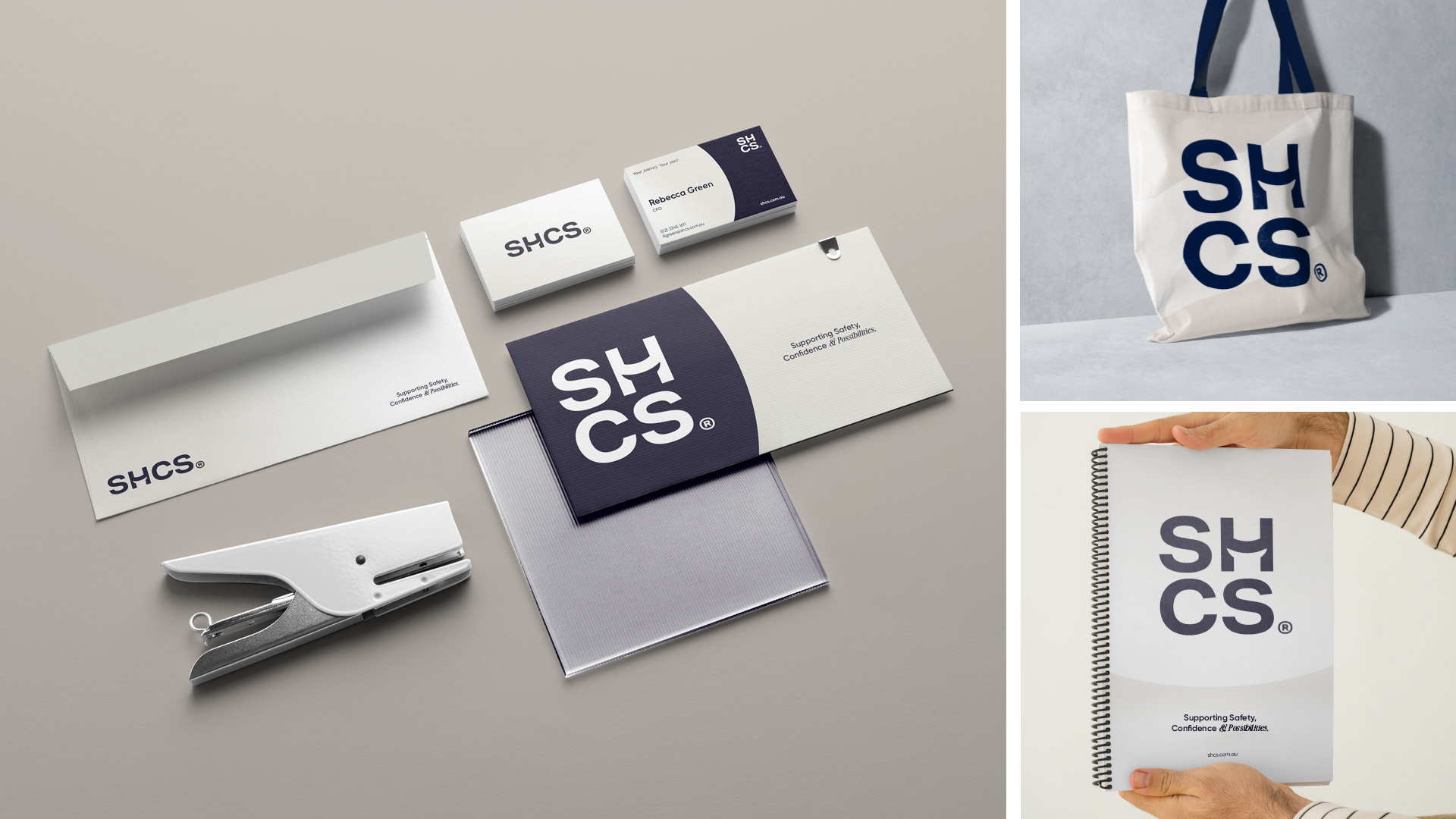
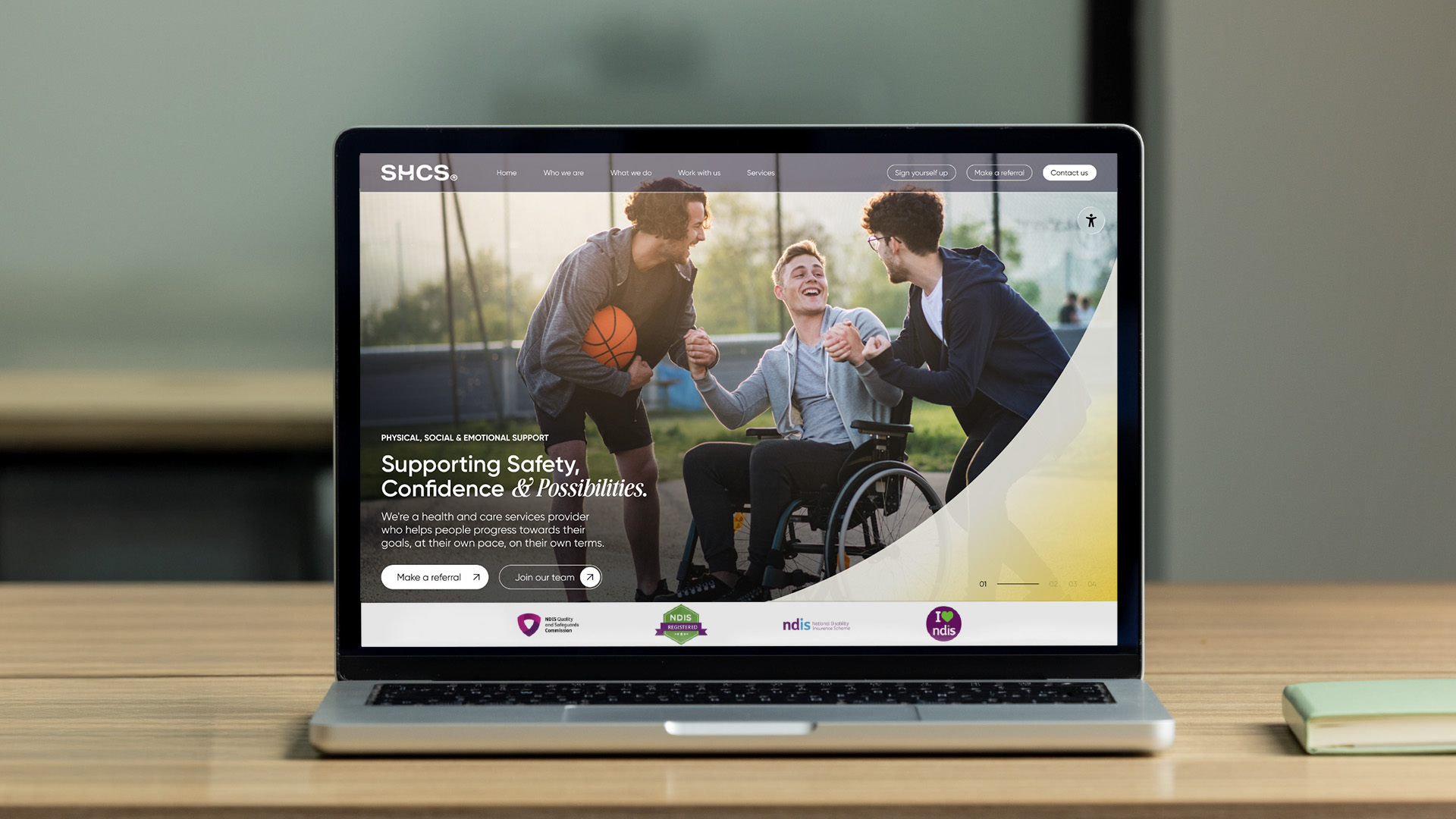
A Smile on the Typeface
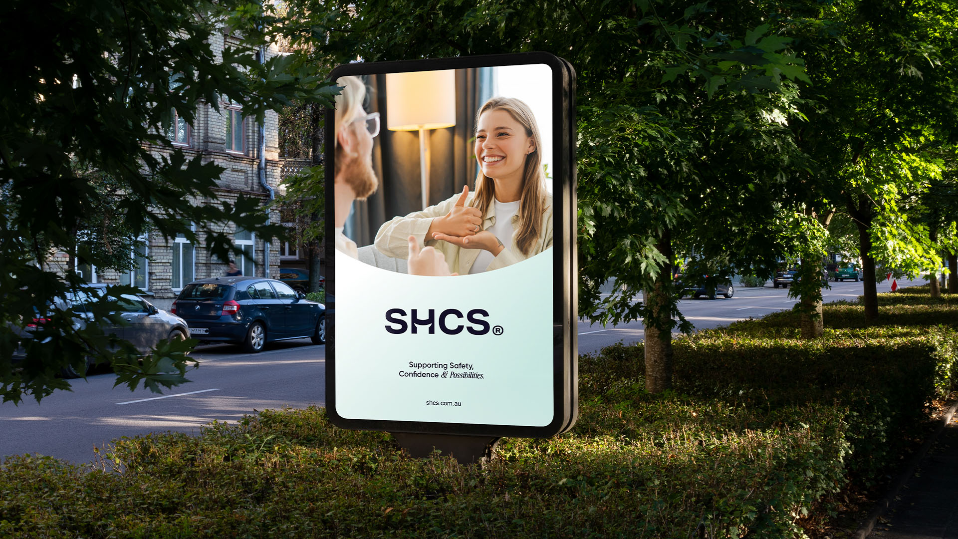
We gave the brand a joyful new font, Gilroy, and added a subtle ‘smile’ symbol into the ‘H’ of SHCS. A great way to show that wherever there’s SHCS, there’s a little more optimism.
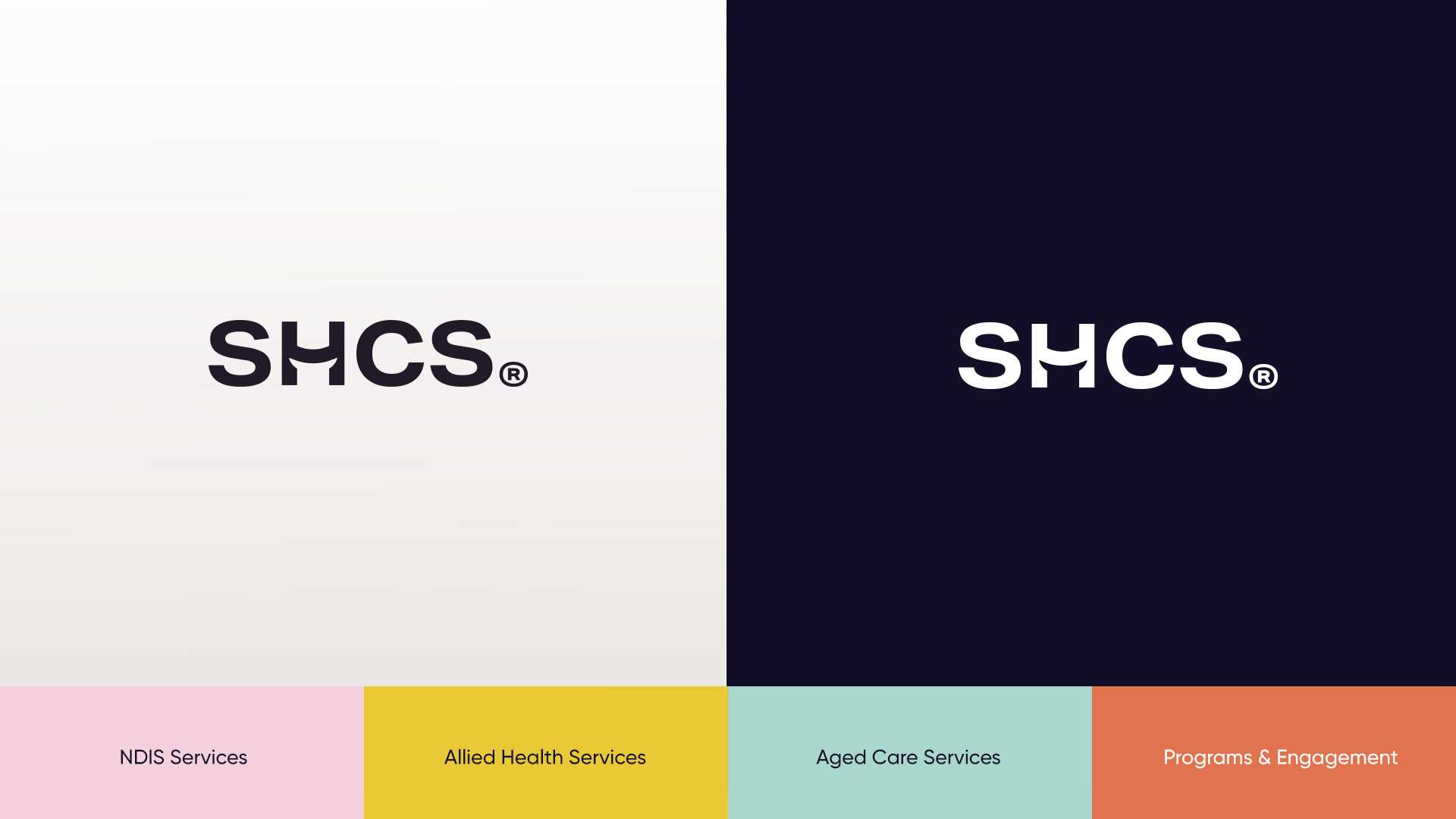
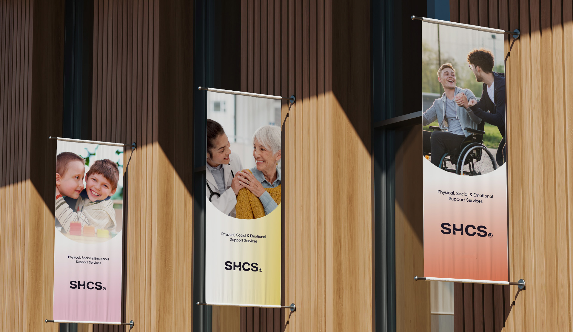
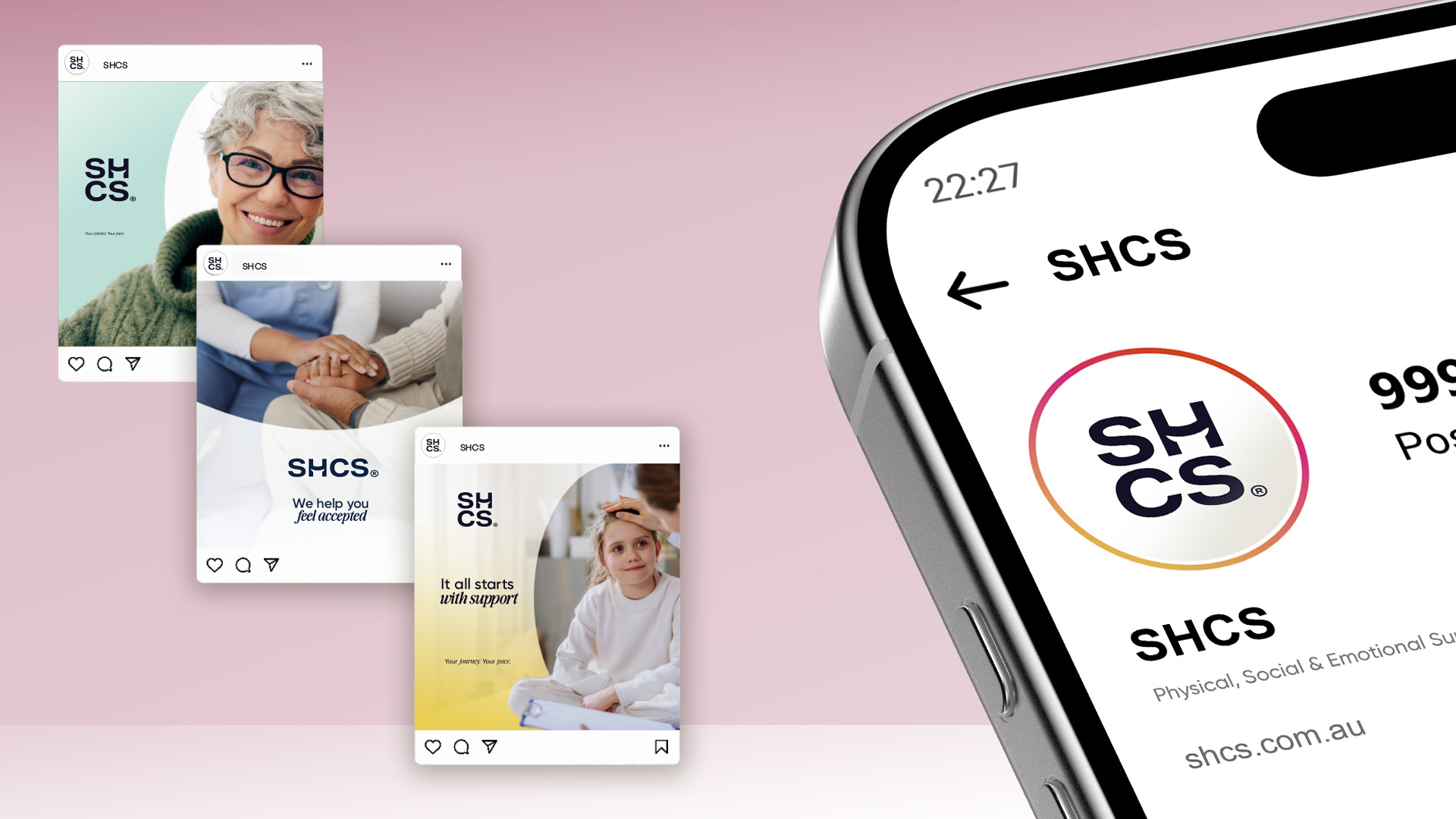
Colours that Flex the Services
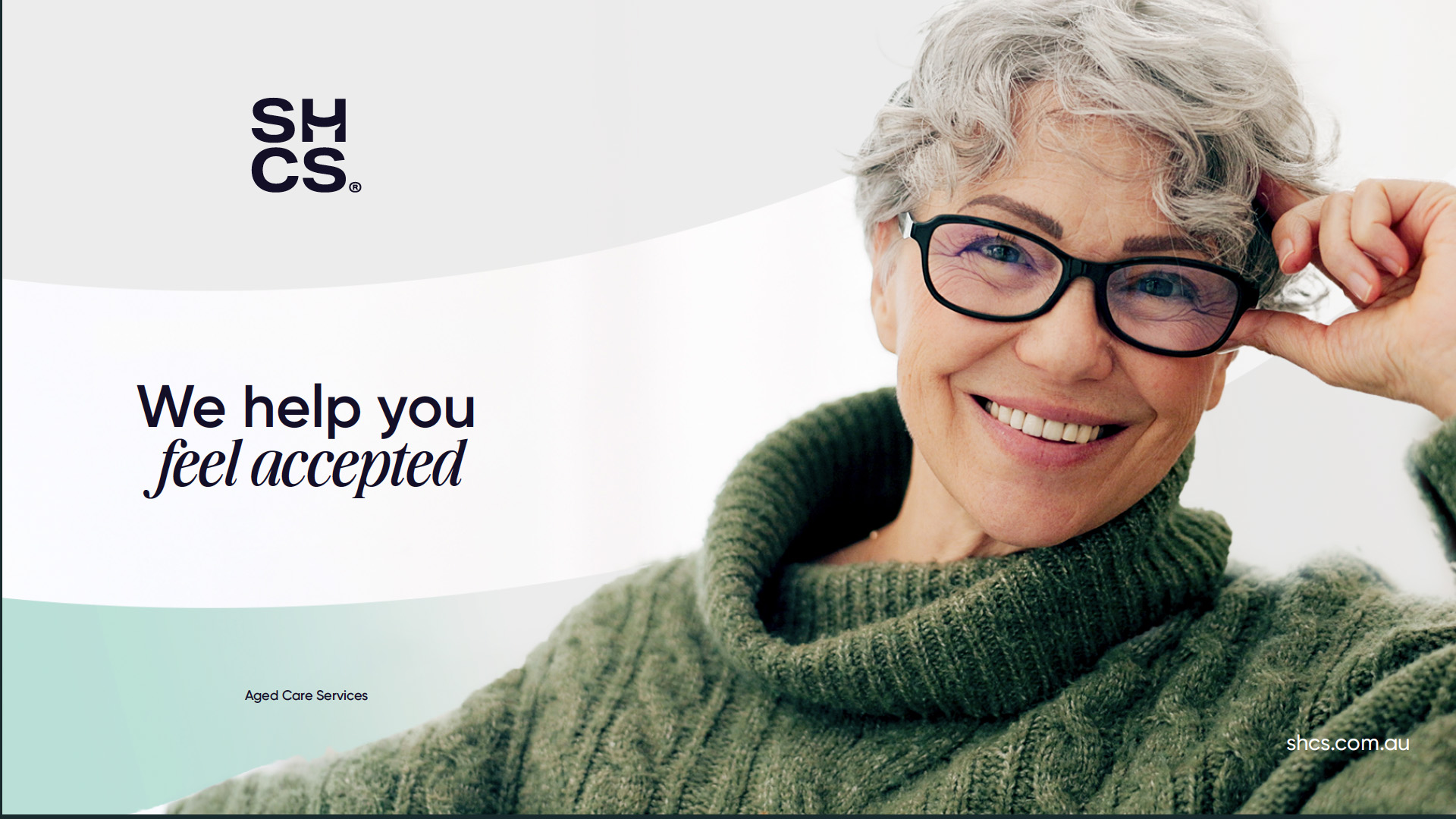
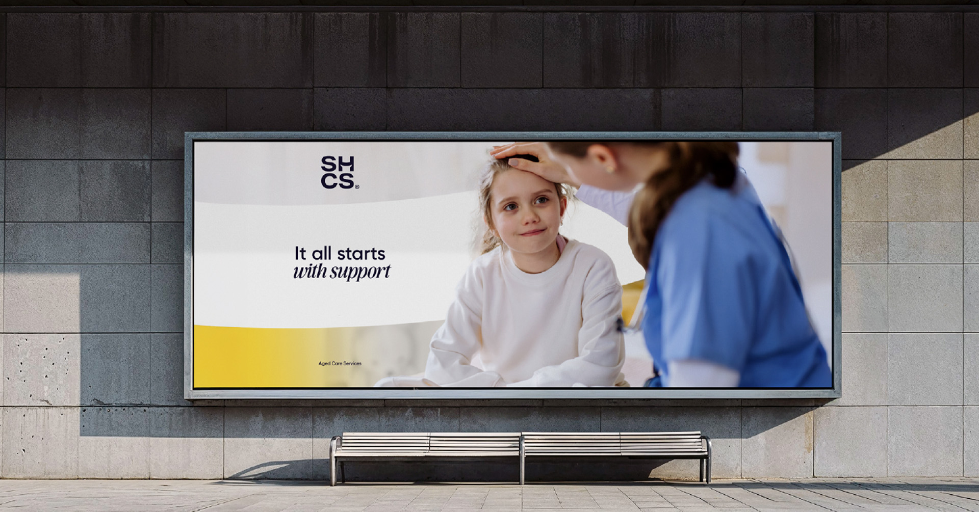
To promote SHCS’ range of services, we built a four-colour brand. Each colour represented a clear area of service in a vibrant but distinct hue: NDIS (Pink), Aged Care (Aqua Green), Allied Health (Yellow), and Programs & Engagement (Orange), with gradients that added an extra pop of energy to each vertical.
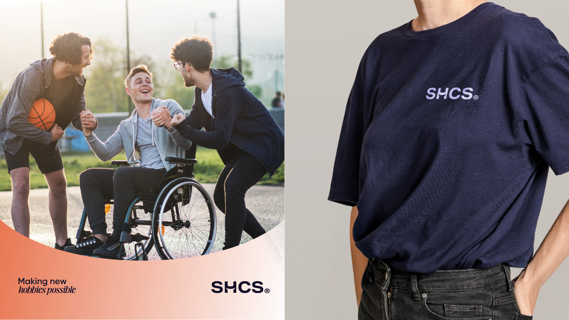
Photography Full of Possibilities
In stark contrast to sector norms, we showed participants enjoying themselves while trying out new things, depicting them in a positive light that celebrates the limitless potential of every individual.
A Positive Voice
We gave them the tone of voice of an inspiring support worker. This struck just the right balance: caring and sensitive, speaking to participants’ everyday need for safety, but also encouraging and clear, encouraging them to zoom out, look ahead and pursue goals that give their life a greater sense of direction, purpose and fulfilment.
More Projects
More Projects


.svg)